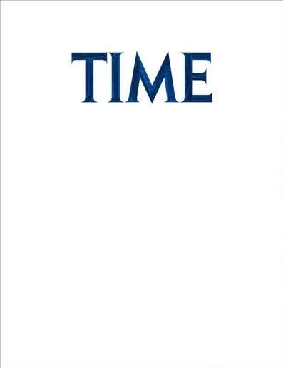
LACMA recently commissioned artist Mungo Thomson to create a limited-edition artist's book, Font Study (TIME), which collects drawings of the Time magazine logo as it has evolved over decades. Thomson will be at LACMA on Saturday to discuss his latest work, in conversation with artist Piero Golia. Here, curator Rita Gonzalez asks Thomson about his project.

Mungo Thomson, Font Study (TIME), 2011, © Mungo Thomson
Mungo, you’ve worked with publications in the past that in some sense are standard bearers in their particular field (Artforum for art and National Geographic for popular ethnography and natural science). What drew you to Time magazine?
The idea that it’s a standard-bearer is probably the reason—it’s “The world’s leading weekly newsmagazine.” I’m drawn to things that have accumulated some consensus, some cultural agreement that lends them an ease of reference. Something has to be familiar before you can attempt to defamiliarize it. At the same time I’m very interested in Heidegger’s concept of “the distance of the near”—the way we stop seeing common things.
I used to do graphic design for a living and I am kind of a font nerd. I try to distinguish fonts on signs and in movie credits and so on, and I spend a lot of time trying to match something to an existing font in my work. And in the course of this project I came to realize that Time magazine might have been my introduction to graphic design. My parents had a subscription to Time and I remember it lying around when I was a kid, changing every week. This was the 1980s, and I remember the banners and the folded-over corner on top of the standard framework of the red frame and Time logo—it got very design-dense then and I remember that it was struggling to manage all this information. So it may be that my own visual literacy begins with Time.
There are so many artists in your generation who are working with newspapers and magazines for imagery to recast and/or represent, especially through drawing. What attracted you to the Time masthead—and why did you want to isolate it compositionally?
When I started this project, I was in a moment of transition in my work from thinking mainly about spatial concerns to thinking more about temporal ones, and starting a new project about time using the Time logo was a shorthand, and sort of a dumb and literal, but also amusing and possibly profound, way to do that. It’s sort of like my Negative Space project: I wanted to make work about “negative space” so I started inverting Hubble photos.
The word “recast” seems astute, because the idea was, at least in part, to recast the Time logo as a stand-in for “time” itself—vast, unknowable, cosmic time. To see if I could take the culture out of something—which of course you can’t. So where Time magazine positions itself as possessing authority and certainty (“Why Your Drugs Cost So Much,” “Why Israel Can’t Win,” “The Meaning of Michelle Obama”), as steering things toward literacy and intelligibility, toward a kind of mass-consumption, fine-grain detail, I am interested in steering the whole enterprise toward abstraction and doubt.
As far as isolating the logo in the drawings, the goal was to make Zen conceptual art with more mass-media noise attached. They are like corporate On Kawaras.
Your artist books are conceptually driven and often not retrospective accounts of bodies of work. Why does the book form attract you?
I have actually made a book on my work that looks like Herman Hesse’s paperback novel Siddhartha (CUENCA) and another that looks like a desert field guide booklet (Easy Field Guide to Mungo Thomson), with drawings of my work instead of photos inside. These were monographs and conceptual projects at the same time. I have said that if I could only make one thing it would be books. I like how when you hold a book, it belongs to you, even though there may be many copies. Circulation is a very appealing idea to me, a singular object that can travel light and have many trajectories.
There are other phenomenological qualities that books have that Font Study (TIME) actually revolves around. Following my publication Einstein #1, which was a full-fledged comic book, I became very interested in the way time happens when you read—how the white gutter between panels in a comic equals time passing, and yet how time pauses when you turn a page. There’s this integral interruption. And then there’s simply that it’s later when you put a book down than when you picked it up. This book was designed in part to call attention to all these things, to its form and structure as a book, to how it is handled and read, as well as to the evolution of the Time logo. So it’s a study of time on all fronts.
Pre-order Font Study (TIME) here. Edition of 50, signed and numbered.
Rita Gonzalez, Associate Curator, Contemporary Art


