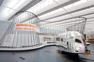
For the ambitious installation of California Design, 1930–1965, LACMA sought out the talents of architects Hodgetts + Fung. We asked Craig Hodgetts and Ming Fung about their design for the show, which is on view now for members and opens to the public on Saturday.
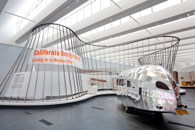
Foreground: Wallace "Wally" M. Byam, Clipper, 1936, Auburn Trailer Collection
What was your inspiration for the exhibition design? The unique look pioneered by California’s modern designers was a direct inspiration for our design. Starting with a curvilinear, biomorphic shape that is a contemporary incarnation of the principles first espoused by Arts and Architecture magazine, the installation is designed to create a powerful sense of solid and void, and to lead the visitor on an exciting, smart journey through the history of California design. This is definitely not a typical, art-historical survey of greatest hits, but a treasure trove of seminal design masterpieces that will resonate with everyone who appreciates the lithe, sensuous lines of contemporary design. Those lines are echoed in the helical construction which soars through the Resnick Pavilion to gather groups of costumes, furnishings, and printed matter into micro-environments which refine and focus the collection. Visitors will be treated to a narrative guided by the rhythm of the helix and propelled by the energy of the curators’ ideas about various aspects of California design history as seen through the lens of those who designed it, made it, and ultimately sold it.
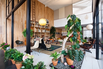
Installation view of Eames Living Room in the Resnick Pavilion. Installation made possible by a generous contribution from Martha and Bruce Karsh
Can you tell us more about the re-creation of the Eames living room? We worked directly with the Eames family to bring to life the incredible collection of crafts, folk art, and found ephemera which Charles and Ray Eames collected over their lifetimes. They are installed in their exact locations in a full-scale reproduction of the famous Eames House. It may be the first time that the house has been paired with its most famous automotive contemporary, the Raymond Loewy-designed Studebaker Avanti, and it is certainly the first time Rudi Gernreich’s seductive bathing suit will be anywhere near it, but such is the energy of the show, and the design which has brought it to fruition.
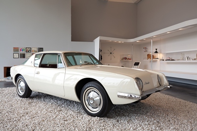
Raymond Loewy, Avanti, 1961, manufactured 1963-64, Petersen Automotive Museum
With more than 350 objects in the exhibition, what sort of design challenges did you face? There were challenges, to be sure. Light-sensitive materials needed protection from the California sunlight which suffuses the Resnick Pavilion, and many of the more than three hundred and fifty artifacts required special treatment. Because objects, costumes, fabrics, and furniture were to be arranged according to the themes of the exhibition rather than by category, the displays needed to be adaptable to a wide range of sizes. Fragile jewelry was to be displayed in the shadow of the Eames house, and a replica of the long-gone setting for a Los Angeles Times photo shoot was to be surrounded by period advertising. The story was magnificent. How to support it by design was challenging, exciting, and rewarding.
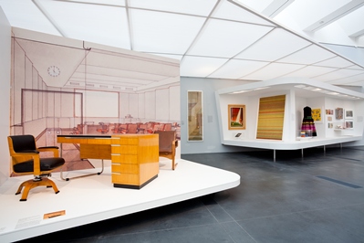
Foreground: Kem (Karl Emanuel Martin) Weber, Desk and Chair, c. 1938, purchased jointly with funds provided by the Decorative Arts and Design Deaccession Fund, Viveca Paulin-Ferrell and Will Ferrell, Shannon and Peter Loughrey, Heidi and Said Saffari, and Holly and Albert Baril; background: Walt Disney Studios, Library Reading Room (presentation drawing), c. 1939, Kem Weber Collection, Architecture and Design Collection, Museum of Art, Design + Architecture, University of California, Santa Barbara
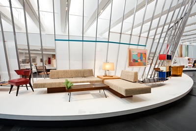
Foreground: A. Quincy Jones and Frederick E. Emmons, Sofa and Table from the Spencer House, 1961-64, gift of Mr. and Mrs. Robert Spencer and Harry W. Saunders
How do you hope visitors will respond to the exhibition? We want this exhibition to echo the unique California life style: to be as supple, as physically beautiful, and as good-humored as the surfer featured in John Van Hamersveld’s Endless Summer poster; to be as disciplined and graphically sophisticated as Ray Eames’ covers for Arts and Architecture magazine; and as accessible as Saul Bass’s advertisement for The Man with the Golden Arm. This is a populist show, designed to echo and magnify the great design tradition which began in California, and is now the standard of the world. Scott Tennent


