On the last day of 2011, we, the editors of Unframed, took a look back on our favorite blog posts of the last year. Charged with each coming up with five favorites proved impossible—we all came back with at least ten, and we overlapped only a little. So instead, we look back on Unframed’s 2011 by a few different themes.
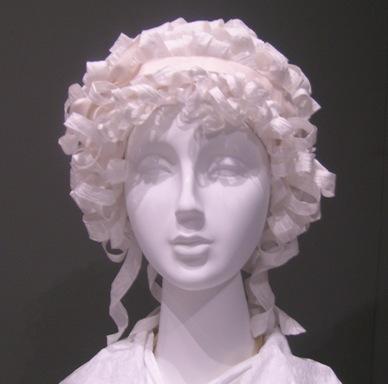
It’s hard to believe the Resnick Pavilion is only a little over a year old. Its inaugural exhibitions were still on view when the year began. Fashioning Fashion in particular was a goldmine of great blog posts. Two of our favorites from the exhibition’s latter months were a how-to guide for making the paper wigs created for the exhibition’s mannequins, and a historic explanation of where the phrase “mad as a hatter” came from.
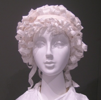
A wig from Fashioning Fashion
Our new restaurant and bar, Ray’s and Stark Bar, opened last February and yielded a few interesting posts on the décor—one on the pattern based on a design by Bernard Kester, who is also featured in the California Design exhibition, and another on the teacups on view in the restaurant. Our favorite Ray’s-related post, however, was about the herb garden he planted right outside the galleries.
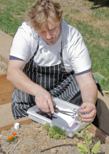
Chef Morningstar in his garden. Photo by Lauren Noble
Behind-the-scenes peeks showing the installation of artworks or exhibitions are always fun. Three of our favorites documented Bruce Nauman’s Human NaturelLife Death/Knows Doesn’t Know, Ai Weiwei’s Circle of Animals/Zodiac Heads, and the ancient Aztec eagle warrior in Contested Visions in the Spanish Colonial World. We also loved one de-installation post—in which Richard Serra’s Sequence dangled high in the sky while it was removed from BCAM earlier this year.
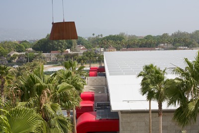
Serra's Sequence moves out
Tim Burton was by far the most popular exhibition of the year, and the same can be said for all of the blog posts we did on the exhibition. Our favorites of the bunch were a peek at Burton Selects—an adjunct exhibition in which Burton himself curated a selection of Burton-esque works from the collection—and an interview with Tim Burton’s high school art teacher. Most inspiring was sales associate Matt Liberman’s observations of the giddy inspiration felt by so many people as they came out of the show.
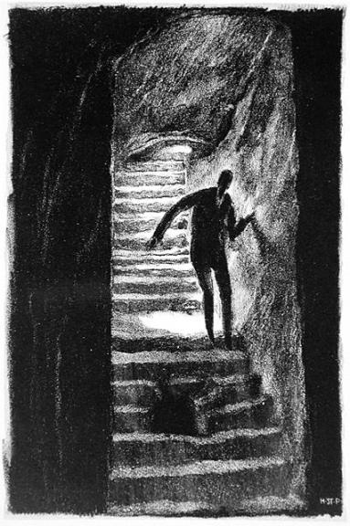
Hugo Steiner-Prag, The Way to Horror, 1915-1916 The Robert Gore Rifkind Center for German Expressionist Studies [from Burton Selects
California Design, 1935–1960: “Living in a Modern Way” has contained a trove of great stories (including some told by the designers themselves), which we began telling well before the show even opened! Some of our favorites have been the story of the acquisition of the Swinger camera, and exhibition co-curator Bobbye Tigerman’s advice on how to start your own midcentury design collection. Also tangentially related was Staci Steinberger’s look at the California pottery that found its way into Simon Rodia’s Watts Towers.
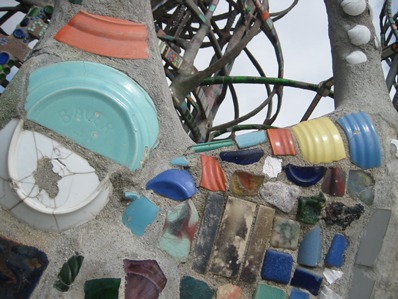
Watts Towers (detail)
Every exhibition yields great Unframed content. Some of our other favorite exhibition-related posts of the year:
- Artist Steve Roden imagined a conversation between two of the artworks in Blinky Palermo
- Exhibition co-curator Tushara Bindu Gude noted all of the curious lists she came across while researching India’s Fabled City: The Art of Courtly Lucknow
- Scott Tennent wrestled with his mortality thanks to Christian Marclay’s The Clock and the moribund exhibition The Mourners: Tomb Sculptures from the Court of Burgundy.
- President Obama’s sometimes odd choices for diplomatic gifts (an iPod? The Godfather trilogy?) coincided with our exhibition on that topic, Gifts of the Sultan: The Arts of Giving at the Islamic Courts (opening at the Museum of Islamic Art in Doha this spring, by the way)
- Hylan Booker mused on David Smith, aka The Man of Steel, and on Glenn Ligon’s depiction of “America’s existential fall guy”
- Curator Stephanie Barron recalled the first time she saw Edward Kienholz’s Five Car Stud, in 1972—also, notably, the last time the artwork was ever on view until its installation here (closing January 15, fyi).
Thanks for reading all year—here’s to 2012!
Scott Tennent, Alex Capriotti, and Jenny Miyasaki


