Rarely does the average person see the same exhibition at multiple venues, except for the truly dedicated art lovers out there. When an exhibition travels, the design plans change due to the evident fact that all museums aren’t created equal; each institution has their unique space, which can allow for a different visitor experience. In the case of In Wonderland: The Surrealist Adventures of Women in Mexico and the United States, the show traveled to three different countries: it made its debut early last year at LACMA, traveled on to the Musée National des Beaux-arts in Québec last summer, and completed its final leg of the tour last month at the Museo de Arte Moderno in Mexico City.
With an art movement as complex and varied as surrealism, there are many approaches to take when displaying the objects. With the exhibition now closed, we can take a look at how each of three venues displayed the subjects of women surrealist artists to the public in their respective countries.
For the Los Angeles venue, LACMA exhibition designer Victoria Behner was given different examples of surrealist exhibitions, particularly Marcel Duchamp’s First Papers of Surrealism in 1942, and also Maya Deren’s film Meshes of the Afternoon (1943), which featured the filmmaker’s experiment with the elements of string.
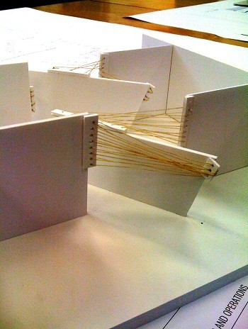 LACMA designer’s original model for the exhibition space
According to Behner, her vision for the exhibition space was “basically the walls and rope [to] work together as a system. The regular architecture (enfilade) is the woman, the shards/slanted walls her issues, and the rope her reparation. That’s why the slanted walls are dark; they’re meant to be violent slashes or gashes. The rope is suturing everything back together.”
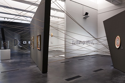 Installation view, In Wonderland: The Surrealist Adventures of Women Artists in Mexico and the United States, January 29-May 6, 2012, Los Angeles County Museum of Art, photo © 2012 Museum Associates/LACMA
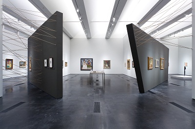 Installation view, In Wonderland: The Surrealist Adventures of Women Artists in Mexico and the United States, January 29-May 6, 2012, Los Angeles County Museum of Art, photo © 2012 Museum Associates/LACMA
In regards to the design plan for the Musée National des Beaux-arts, the museum was challenged to present the content of the exhibition in three separate gallery spaces. Taking note from the design of the In Wonderland catalogue (see a promotional video here), the use of the red was mimicked, using the flow of the cursive on the text cover to tie the three galleries together, this trail effectively becoming a “white rabbit” for the visitors to follow into the In Wonderland exhibition (note even the security tape reminding visitors to watch their step is red).
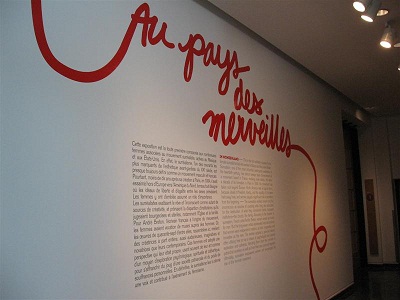 Images courtesy Musée National des Beaux-arts, Québec
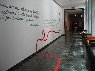 Images courtesy Musée National des Beaux-arts, Québec
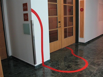 Images courtesy Musée National des Beaux-arts, Québec
In the final venue of In Wonderland, the Museo de Arte Moderno took a more whimsical approach with their exhibition space, playing with angular disproportionate shapes along with their curved gallery. Featuring checkerboard panels extending up and across the ceiling, this game-board motif touched upon of the show’s themes of games, where artists experimented in their surrealist makings (chess or drawing exquisite corpses are just a couple of examples).
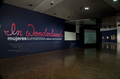 Francisco Kochen. Photographer. Courtesy Museo de Arte Moderno-INBA.
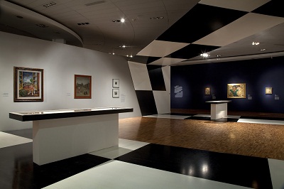 Francisco Kochen. Photographer. Courtesy Museo de Arte Moderno-INBA.
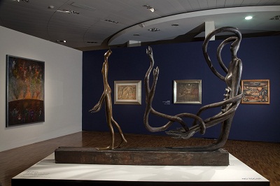 Francisco Kochen. Photographer. Courtesy Museo de Arte Moderno-INBA.
Now that we’ve seen different examples of exhibition design, how does the process go from concept to an actual installation? Stay tuned for more . . .
Devi Noor, Curatorial Administrator, American Art


