If you were to search on Google the phrase Japanese graphic design, itʼs likely that you would uncover Tadanori Yokooʼs extraordinary visual exuberance or Shigeo Fukudaʼs bold satirical clarity. It would take additional digging on the web to discover any of the poetry books designed by Kitasono Katue. Kitasono (1902–1978) was a designer, writer, editor, photographer, and overall ambassador of Japanese avant-garde art to Europe and the Americas in the mid-20th century.
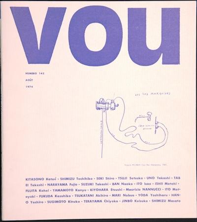
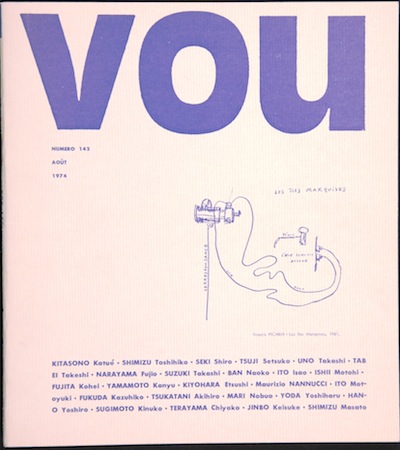 Kitasono Katue, VOU magazine, number 143, August 1974, collection of John Solt
Kitasono remains a relatively unknown figure in the history of graphic design, despite having generated an incredible body of work. One explanation for this could be that many design historians simply categorize him more as a writer and poet rather than as a designer. Another likely reason is that popular graphic design history tends to overlook work coming from Japan between 1900 and 1960. Given the expansion of roles that designers take on these days—many work as editors, curators, writers, filmmakers, and shopkeepers—Kitasono is more important than ever. Kitasono's life and work offers context to the varying design practices happening today.
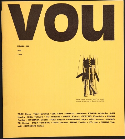 Kitasono Katue, VOU magazine, number 146, June 1975, collection of John Solt
It would be naive to speculate about Kitasonoʼs practice without acknowledging the events and conditions he was operating and reacting against: the simple fact of geography, Japanʼs neutrality in World War I, and the Great Kantō Earthquake of September 1, 1923. All these circumstances contributed to why Japanese artists and writers (like Kitasono) had a tendency to translate, interpret, misinterpret, and borrow concepts of the European avant-garde (such as Futurism, Dada, or Surrealism) very differently from their Western counterparts.
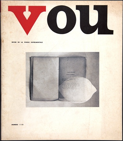 Kitasono Katue, VOU magazine, number 110, collection of John Solt
While itʼs clear that Surrealism appealed to Kitasonoʼs later imagery that juxtaposed objects, ideas rooted in Dada gave Kitasono an opportunity to reshape his creativity. Dadaʼs direct influence can been seen in Kitasonoʼs involvement with Japanʼs first Dadaist magazine, Ge.Gjmgjgam.Prrr.Gjmgem, published from 1924 to early 1926. The magazine, which highlighted the intricacy and absurdity of modern life, and Kitasono's affiliation with young Japanese poets allowed the artist to broaden his inventiveness to include katakana words (Japanese syllables), scripts, signs, Arabic numerals, arrows, dots, and various types of lines into his poems.
Kitasono's participation with G.G.P.G. initiated his interest in Surrealism. In 1935 principles from both Dada and Surrealism merged when he established the VOU Club and its avant-garde poetry journal, VOU. Vou, which was more or less Kitasonoʼs version of the word Dada, was meant to be an “empty” word in which a revolving group of poets, artists, composers, and architects were invited to define its meaning. Among Kitasonoʼs most interesting works in VOU were his (Surrealist-inspired) Plastic Poems, which were juxtapositions of fragmented bits of waste. Kitasono also served as the the editor and primary graphic designer for the publication.
VOU, published 1935–40 and 1949–78, was undoubtedly produced under budgetary constraints. The magazine varied in format, but never echoed the spirited typographic spontaneity of many other Dada-inspired publications. Looking at issues of VOU, it's hard to believe how sophisticated, simple, and personal the magazine feels. Even as typographic trends changed throughout the 20th century, issues of VOU never seemed to adopt a strict grid, but rather always embraced the poet-designer's intuition and personal balance.
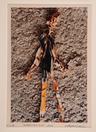 Kitasono Katue, Forgotten Man, 1975, © Sumiko Hashimoto, collection of John Solt
Aesthetics aside, an immensely interesting part of VOUʼs existence was its distribution. A chapter in John Soltʼs Shredding the Tapestry of Meaning: The Poetry and Poetics of Kitasono Katue, brilliantly titled “Kit Kat and Ez Po,” details the respectful yet peculiar friendship between Kitasono and Ezra Pound. Not only does this section show how ideas circulated pre-Internet, but just how divergent philosophies regarding avant-garde art and writings were from East to West. VOU was Kitasono's most consistent body of work as a designer, but he designed numerous books, most notably The Album of Whiteness (1929) and Black Fire (1951), book covers, journals, publications, advertisements: all while holding a day job as head librarian at the Nihon Shika Daigaku (Japanʼs dental college). The majority of these other materials have a sense of restraint, but plenty of imagination. Many of the colors and freely invented organic shapes Kitasono employed definitely echo the playful work of American designers Paul Rand, Alvin Lustig, and Alex Steinweiss.
Kitasono may have been overlooked or underrated as a graphic designer, but his textured life, wandering mind, and abundant enthusiasm for creating is as relevant as ever for present-day graphic designers to observe. Notwithstanding the wonderful work in the exhibition, the best part of Kitasono Katue: Surrealist Poet proves that not everything is in the history books or easily “Googleable.”
David Karwan, graphic designer


