Installing a sculpture exhibition—particularly one in which works are bound to walls, sit on pedestals, hang in the air, hover close to the ground, and vary significantly in scale—can be tricky. In developing this exhibition, I reviewed historical photos of Calder’s studio and presentations he designed and compared them with exhibition design from the past 40 years. During Calder’s lifetime, displays seemed to mimic those found in his studio: crowded together, overlapping, presenting a riotous cacophony of competing forms far removed from contemporary concerns of conservation and visitor-circulation paths. In the past few decades, museum exhibitions have had to grapple with these real concerns, which are exacerbated by increasingly large museum crowds. Extensive plinths, protective barriers, and pedestals mitigate intentional or inadvertent touching, but can hinder the viewer’s ability to relate intimately with the works. Clearly, decisions about density, space, light, and color would need to be weighed against concerns for the safety and protection of the art.
We were fortunate that architect Frank O. Gehry shared an enthusiasm for Calder’s work; his experience of seeing the artist’s 1964–65 exhibition in Frank Lloyd Wright’s Solomon R. Guggenheim Museum in New York had made an indelible impression.
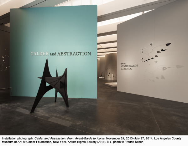
The gently curved walls that frame many of the sculptures in LACMA’s exhibition emphasize the organic nature of Calder’s works, recalling the harmony between art and architecture found in the Guggenheim’s presentation. Furthermore, Gehry’s own method of developing architectural forms is inherently tactile, sharing some of the same hands-on techniques of a sculptor. I too remember the Calder show at the Guggenheim—it is the first show I recall seeing there—and when I worked at the museum in the early 1970s, colleagues still spoke fondly of it being the most perfect example of an exhibition combining art and architecture.
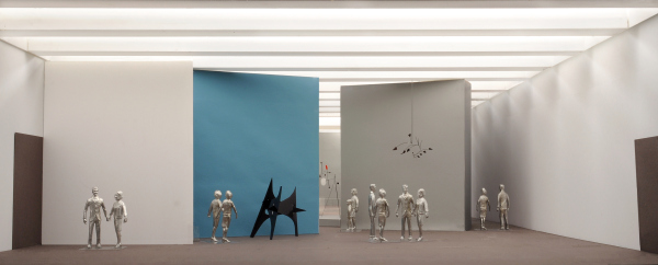
 Gehry Partners, LLP, model photographs for Calder and Abstraction: From Avant-Garde to Iconic, Los Angeles County Museum of Art, 2013
Working through successive models—in paper, Gator board, basswood, and Plexiglas, and in a variety of scales—Gehry’s models are conceptual drafts, or three-dimensional sketches, integral to the final design of a project. It was fascinating to see how Gehry’s office prepared actual small-scale sculptures so that we could figure out how they would rotate in space and how to best protect them. From my early discussions with Gehry about Calder, it became clear that he could produce a remarkable and unique installation that could create a memorable experience for visitors. Although Calder was known to work with architects and luminaries from other fields during his lifetime, no exhibition of Calder’s work has engaged a major architect in three decades.
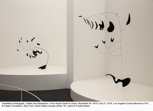
Another aspect of planning the show that was critical to me was the desire to slow down people’s looking at the works of art. We purposely limited the selection to feature 50 objects—giving the art ample space to breathe. Gehry’s design underscores how to look at the works. We also wanted to encourage people to spend more time with individual objects so that the gentle movement can be observed. If you take the time in the show, you can easily understand the observation that Jean-Paul Sartre made in the 1940s after visiting Calder’s studio: “But suddenly, when the agitation had left [the mobile] and it seemed lifeless again, its long majestic tail, which until then had not moved, came to life indolently and almost regretfully, spun in the air, and swept past my nose.”
For the complete set of photographs of the installation, click here.
Stephanie Barron, Senior Curator, Department Head of Modern Art


