In conjunction with the museum’s free community day that took place on April 26, 2015, celebrating LACMA’s 50th Anniversary, the Education and Public Programs Department created a handout titled “50 Ways to Love LACMA” with connections to the collection ranging from suggestions for looking closely at works of art to interactive and facilitated experiences.
Grouped by location, visitors were asked to consider how artist Robert Irwin translates traditional art elements such as texture, pattern, line, and scale, in his work, Primal Palm Garden when looking at artworks outdoors. In the Ahmanson Building, visitors could find hidden messages of mortality by looking for elements that show the passage of time in the Banquet Still Life by Abramam van Beyeren, or learn about a performer impersonating the goddess Kali by listening to a mobile-tour stop. In the Pavilion for Japanese Art, people were encouraged to use their imaginations to picture a royal tomb filled wth hundreds of Haniwa sculptures.
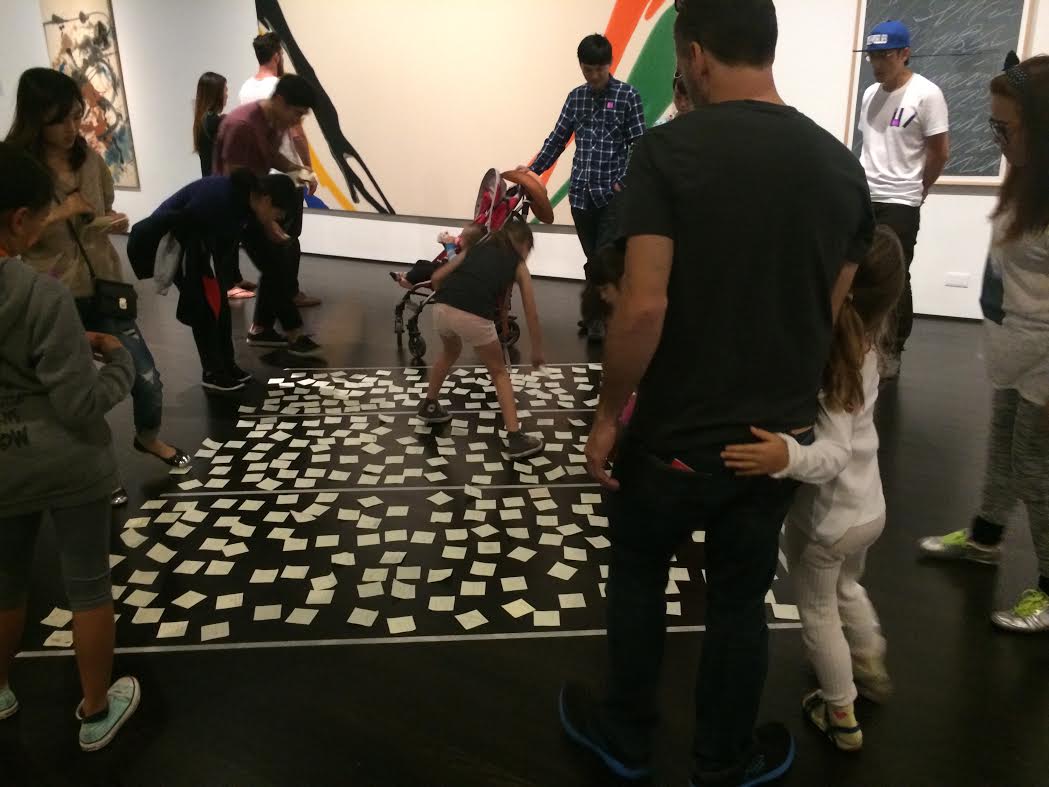
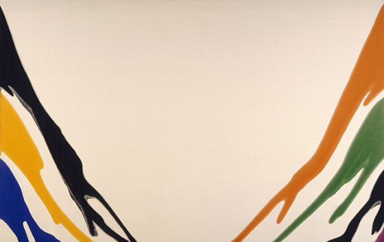
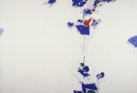
And for visitors who wanted to probe deeper, educators devised a number of interactive experiences. Among them was a Venn diagram to compare two Abstract Expressionist paintings in the modern galleries. Using tape on the floor and yellow sticky notes, visitors could record similarities and differences in two works by artists Morris Louis and Sam Francis. Visitors filled the floor with insightful comments. Here are a few.


Certain level of imbalance and emptiness
Seems like something bigger is happening around it that we can’t see
Creamy and saucy
More flowing
Smoke on the water
Seems more symmetrical
More mellow painting; makes you relax
A waterfall, ski slopes, rainbow, colorful zebra, minimalist
Systematic, has a sort of pattern to it
Dreams in a shore with white sand
The negative shape in the center; the color pattern on the sides
Outlines from a diagram from a science class
Painted on the floor
Boring but intriguing

Uses mostly cool colors except for the focal point
More spontaneous
Looks like he just splashed paint on the canvas
Splatter=movement
Earth, network, collision, sadness, space, speed
More blue, lots of blue, blue shatter
Water splashes after diving into a pool
Los contrastes de colores
Vertical direction
Small amounts of color. Even smaller use of red and orange. Much more complex
Erratic, messy, energy, pure, clean, noisy, negative space
Inside color, outside space
It’s drippy blue and green, it’s splattered
I see a chaos sky, as if our universe is tearing apart
And when comparing similarities, visitors had the following observations:
Both are happy and sad at the same time; slow and fast at the same time
Emphasize shape of paint as it drips
Lots of negative space, lots of white space
Both use large amounts of open space and solid colors
Organic shapes, bright colors, abstract, purposeful
Beautiful and calming
Same colors used—black, blue, purple, green, orange, yellow
Big and inviting to dive into
The best of both worlds
Simple, abstract, non-objective, relaxing, elegant, colors, fluidity
Movement of color across the canvas
Simple with deep meaning
Use this PDF to explore the collection on your own.


