The office of Victoria Behner, LACMA’s assistant director of exhibition design and production, is decorated with art-related knickknacks and books, but most of the space is taken up by rolls and rolls of gallery blueprints, floor plans, and elevations. As the behind-the-scenes team that puts together temporary special exhibitions and permanent collection installations, her department is responsible for every exhibition’s physical design and its overall effect. The slightest shift in display can impact a viewer’s experience, and the exhibition design team manipulates these shifts to tell a complete story.
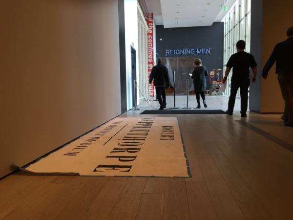
As I walk in, Victoria crosses out a note with green Sharpie pen, slides a roll of blue tape onto her wrist, and invites me to BCAM’s second floor, where she’s preparing display cases for Robert Mapplethorpe: The Perfect Medium. We step out of the elevator over the noise of whirring machines from the adjacent gallery where Reigning Men: Fashion in Menswear, 1715–2015 is being installed. Victoria, who came to exhibition design while working on a doctorate in architectural theory and history, tells me that she likes this part of the project. “It smells like progress,” she says with a smile.
The walls where Mapplethorpe’s work will hang are blank and warm gray. Footsteps echo as we step through the galleries, which, mere weeks ago, housed New Objectivity: Modern German Art in the Weimar Republic, 1919–1933. We find a mismatched assortment of Plexiglas display cases and bases of various sizes, a handful of chairs, and in some rooms, absolutely nothing.
Victoria begins blue-taping her plans to their corresponding cases; I try my best to stay out of the way as she slaps a tape measure across each case while art preparators pass, rolling imposing-looking pallets. When everything’s done, we head back to her office, where she rips open packages containing plush, what she calls “fuzzy,” rolls of deep red and pale gray velvet that will line the cases’ interiors. We sit in her office among the blueprints to discuss the installation process, where exhibition design begins and how it comes to its final product.
“The first thing that I look forward to is our first meeting with the curators,” she says. “That’s when they’ll present the narrative of the show and introduce us to the different [artworks]. The real goal, for us, is to support the curators’ narrative, not introduce another one.”
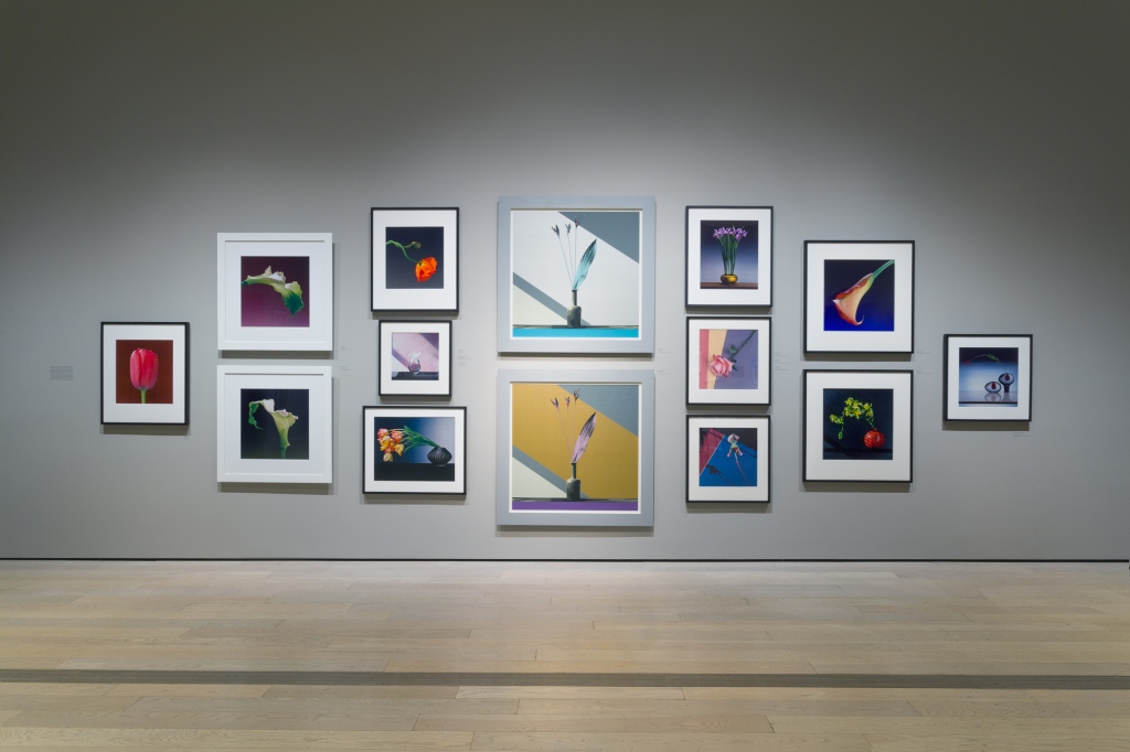
She reveals that the Mapplethorpe narrative came together in an interesting way: the show’s curator, Britt Salvesen, reached out to one of Mapplethorpe’s former associates to learn what colors the photographer was drawn to in order to determine the palette the museum should use. Exhibition designer Martin Sztyk took the lead on the design and tells me about the process in a separate conversation: “We were in touch with the [Robert Mapplethorpe Foundation],” Martin says, “and there was this particular paint that [Mapplethorpe] loved using and it worked really well with black and white photographs. I did provide different schematic ideas; I built an entire 3D model and we picked a few views throughout the gallery. I hit it with different paint types based on the information that was given to us by the foundation. Instead of taking a leap of faith with a particular color or a certain scheme, I introduced maybe six or seven different schemes that eventually boiled down to one.
“After that it came down to the casework,” he says. “[We decided to] make it raw, exposed metal. Then we decided the vitrines were going to definitely be fabric-wrapped and we had to go with some kind of velvet. There was actually a wide array of fabrics we were going to use in the vitrines, but we narrowed it down to black, gray, and red. We were thinking of a burnt orange, which was a color he really liked using, and a robin’s egg blue. Like the paint, eventually we just started honing in and narrowing down all the colors.”
Mapplethorpe also harkens back to a classic hanging style: salon style. The paintings are strategically clustered rather than shown one after the other at eye-level. “The galleries are very heavy,” Martin says of the show. “There are a lot of works on the walls...and you don’t want to cut anything; you want to keep as much as you can. With the flowers, we of course wanted to concentrate and celebrate them on one wall. The salon style works well—you get that vista when you’re going into that gallery.”

Since an exhibition designer’s primary job is facilitating the curators’ vision and making for a seamless, integrated installation, the work of Victoria and her department is almost invisible. But that kind of effortlessness doesn’t come easily or quickly; it takes planning, it takes conversation, and it takes its own vision. According to Victoria, three key components contribute to a successful effect for the audience: “You can do a lot with light, placement, and color. That’s all it is. After that, you can get fussier. But the color of the light will change the color of the space. It starts with the light and then keeps going.”
Martin adds, “You go through certain narratives, certain things about a particular artist and you boil it down. You don’t want to cast a deep shadow on the work because you’re taking all these design liberties—the work speaks for itself, you don’t need to prop it up that much.”
“When it comes to the install of the artwork, I will set up the context,” Victoria says. “But I usually back off and allow the curatorial team to install the art on the wall. [A successful design] depends on how [the work] is looking at you, too. And if it’s a figure, where are the eyes? You have to go to the art.”
As for which exhibitions are most challenging to work on, she explains: “Sometimes shows are complicated just because the art is complicated. How vulnerable is the work? What are the conservation requirements? How do you handle it? But then, sometimes you’re dealing with installing Rain Room. That can be a little fussy, too. James Turrell: A Retrospective was huge. Basically, when we were fabricating the space [for Turrell], we were fabricating the art itself.”
Mapplethorpe may not require the plumbing of Rain Room or the space fabrication of a Ganzfeld work by James Turrell, but it still takes extreme consideration for how the smallest changes will translate to the audience.
I ask her if there’s anything else about her job that most people don’t realize.
“I don’t think [many] people know that this job exists,” she concludes. “You don’t think: this is what I’m going to be when I grow up. You don’t know it exists until you get here.”
Martin agrees that his background in architecture lent itself well to exhibition design. “With architecture, the schedule tends to draw out for years,” he says. “But here, the turnaround is so exciting. You might have to put something down on paper and then within two months it’s actually there in the physical realm. I think it’s such a huge benefit to anyone that studies architecture to be there onsite day after day to see it come together.”


