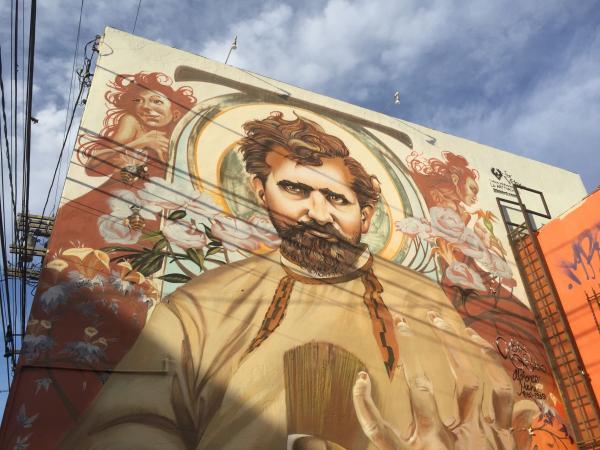
I was headed to LACMA one morning last spring, driving west down 6th Street, when a mural I had never noticed caught my eye just as I crossed La Brea Avenue. I did a cartoonish double-take, narrowly avoiding an accident in rush hour traffic, and swerved into an alley behind a handful of furniture and lamp shops. In front of me, larger than life, was a two-story-tall portrait of Art Nouveau icon Alphonse Mucha painted on the side of Liz’s Antique Hardware. I was then in the process of organizing the exhibition Apostles of Nature: Jugendstil and Art Nouveau, now on view at LACMA, and Mucha’s portrait was one I would have recognized anywhere, especially when surrounded by the trappings of his signature style. The mural depicts Mucha, a serious but affable-looking man with a thick coif of dark brown hair, against a backdrop of flowers and bees. His head is centered on a circular motif that looks like a golden halo, bracketed on either side by female figures in sepia tones. In one hand he clutches a large brush close to his chest, while the other hand, exaggerated in scale, rises up from the bottom of the composition as if he holds the universe in his palm.
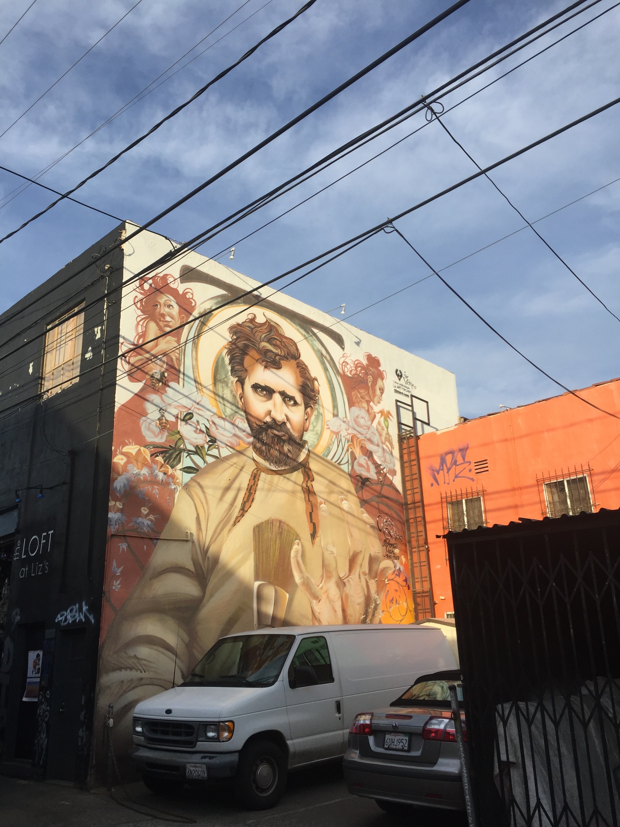
Painted in 2010 by L.A.-based graffiti artist Mear One, the mural took nine days to complete and remains in excellent condition after nearly seven years. While it initially seemed quite odd that I would find an elaborate homage to Mucha in an alley in Los Angeles, the siting of the mural in a part of the city historically rife with wholesale home furnishing stores makes perfect sense given the ubiquity of Art Nouveau flourishes in the decorative arts, even today.
The style known in France as Art Nouveau (and in Germany as Jugendstil, or youth style) was in vogue in Europe and the United States at the turn of the 20th century, waning in popularity around 1914, with the onset of World War I. Not just a style, Art Nouveau was a movement inspired by the socially progressive British Arts and Crafts movement of the mid-19th century, dedicated to breaking down the hierarchies that divide fine and decorative art.
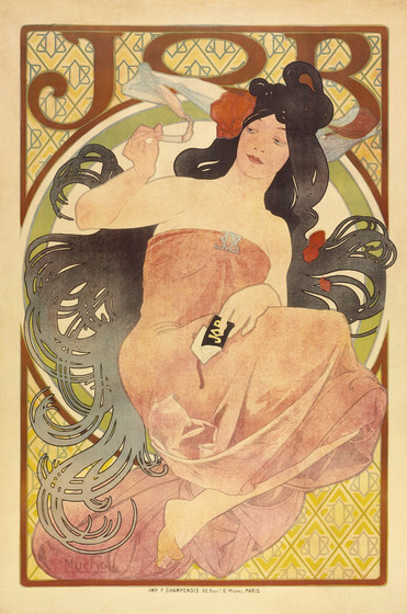
Mucha, a Czech-born artist who became strongly identified with Parisian Art Nouveau in the 1890s, made fine art prints, commercial posters, theater stage sets, jewelry, and much more, with a distinct style that employed serpentine lines and intricate patterning drawn from Eastern European folk art. Seductresses in loosely gathered togas, with wild, swirling hairdos, often anchored Mucha’s graphic work, embodying natural beauty and, in some cases, freedom and liberation. More importantly, they meshed neatly with the repeating patterns of abstract shapes and symbols that Mucha used to fill negative space in a composition, creating an effortless harmony between image and design that worked just as well for fine art prints as it did for advertisements.
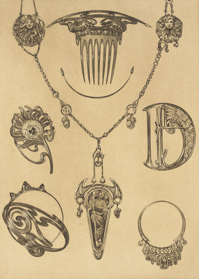
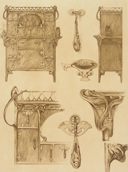
Mucha’s work was much copied in his own lifetime, and he even designed an 80-page illustrated manual for designers full of Art Nouveau motifs that could be adapted for projects in virtually all media, from typography to interior decoration. (Eight pages from the manual can be seen in the LACMA exhibition.) Considering Mucha’s self-promotional prowess, it’s unsurprising that his legacy lives on to the present day, inspiring, as we shall see, artists of all stripes.
After spotting the Mucha mural on La Brea, I started to experience that uncanny feeling psychologists have termed the “frequency illusion.” I was suddenly seeing references to Art Nouveau everywhere, having never before been so attuned. I was stunned, for example, by a sequence in the animated film TOWER, which screened last fall at Cinefamily, a small independent theater near LACMA, after winning the Grand Jury Prize at SXSW. Directed by Keith Maitland, the film dramatizes the 1966 mass shooting at the University of Texas at Austin, in part through moving interviews with survivors and witnesses. As the film details, the unprecedented event left the community in shock, unable to process the trauma of what had happened; classes resumed after only a day, leaving little opportunity for public grieving. (Remarkably, it was only with the release of Maitland’s film, and at the urging of alumni survivors, that UT Austin finally erected a memorial last July.)
Forty years after the event, the writer Pamela Colloff chronicled survivors’ stories for the first time for the magazine Texas Monthly, in a heart-stopping oral history that became the impetus for Maitland’s film. The most incredible testimony is offered by Claire Wilson (now Claire James), who was a pregnant first-year student walking across campus with her boyfriend, Tom Eckmann, when both were shot by an unseen gunman. Claire’s story, elaborated through more recent interviews with Maitland, frames much of his film, which places us in the action of the unfolding event. Unlike most documentaries, TOWER does not rely on archival footage or live-action re-creations (which would not have been possible on the UT campus), but instead uses rotoscoping, a technique in which animators create drawings over live action footage frame-by-frame, to develop a fully animated final product with a naturalistic, almost painterly aesthetic. Rotoscoping allowed Maitland to re-stage important scenes and to use live actors to portray the real characters of the story, without the obvious (and sometimes cheesy) artificiality from which dramatizations typically suffer. The animation makes for a surprising and compelling cinematic experience that, in a way, offers a rebuttal to the long-standing charge that we are desensitized to violent images and the events they document.
Acted in the film by Violett Beane, Claire recounts her experience that day in rich detail, from the moment she’s shot to her improbable rescue at the hands of a teenage boy more than 90 minutes later. At one point, she pauses to describe her romance with Tom, who died instantly on the ground beside her. When her story shifts from the moment of the shooting to the life she and Tom had shared, the style of animation also shifts abruptly. Their portraits remain rotoscoped, but Claire and Tom are momentarily transported from the horror of the besieged college campus to a dreamland of Art Nouveau, Mucha-inspired motifs, their youthful faces surrounded by decorative gold frames intertwined with vines of white flowers.
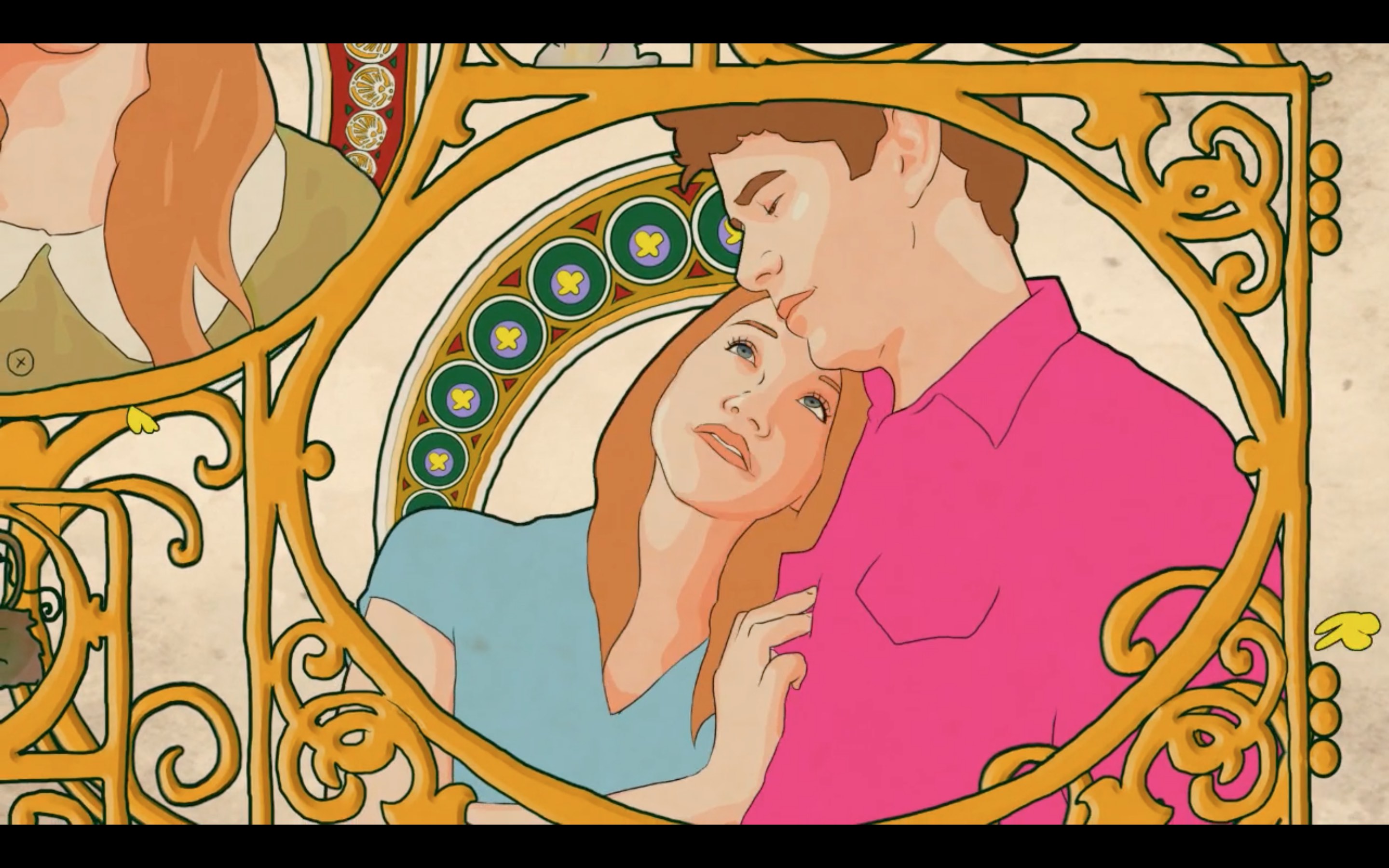
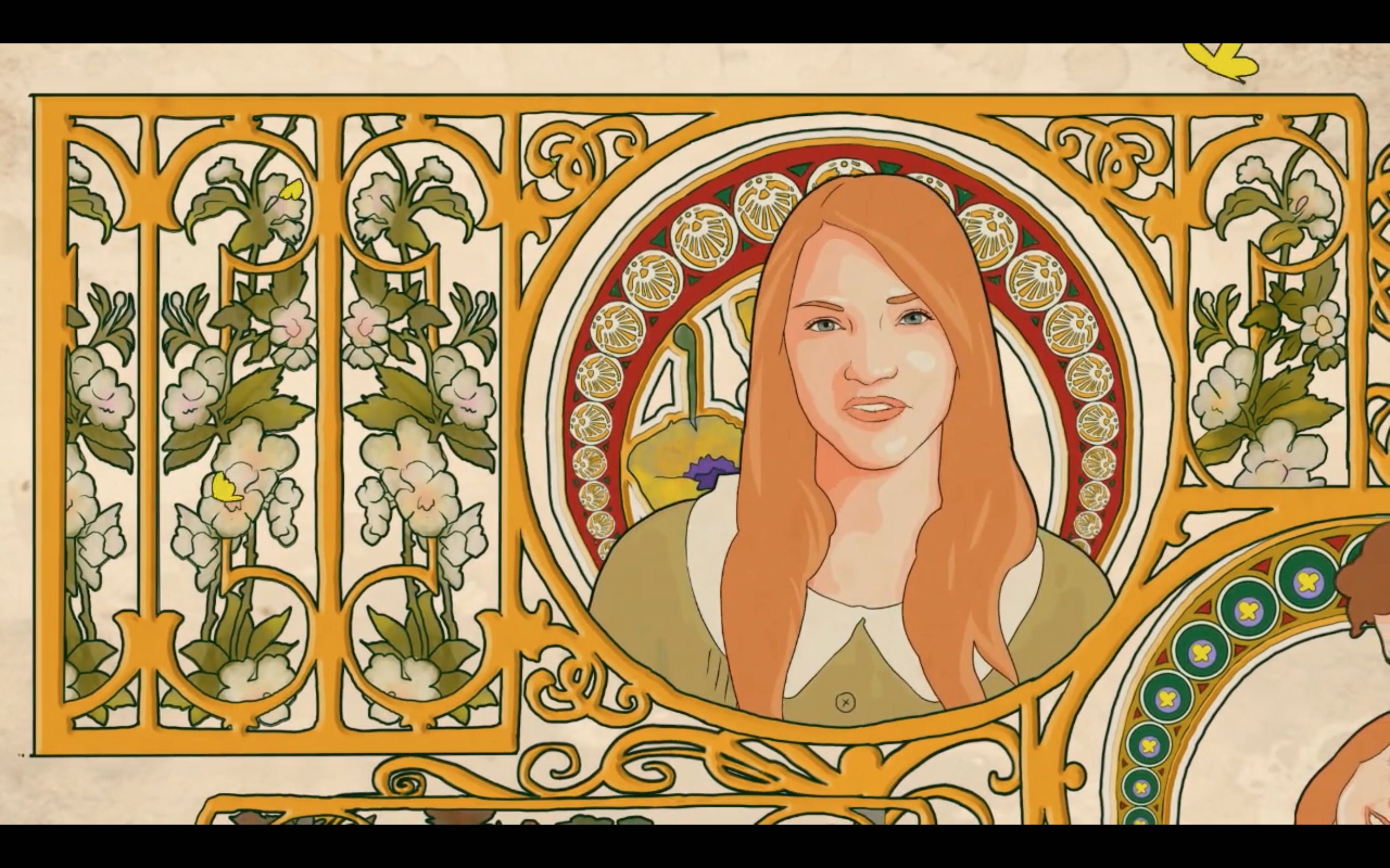
I asked Maitland, who generously provided stills of the sequence for this blog post, what had motivated him to turn to the style of Art Nouveau to illustrate Claire’s remembrances. “As the director of the film,” Maitland explained, “I was looking for ways to visually personify the love affair between Claire and Tom in the summer of 1966. I knew that we would incorporate an of-that-moment Peter Max style to some of the visuals, but I also wanted to steep the scene in a more timeless sense of romance as well. I have always been drawn to the posters and paintings of the Art Nouveau movement and I realized that there was kind of a reinvigorated appreciation for Art Nouveau in the mid ’60s, so I thought it would be a good counterpoint visually to all of the flower power imagery.”
Peter Max’s psychedelic, Technicolor designs are far more saturated and saccharine than those of Mucha, but the influence of Art Nouveau is indeed apparent, as others have also observed. Take, for example, Max’s 1968 advertisement for the New York hippie clothing shop The Different Drummer. The helmeted, androgynous head floating in rainbow-hued clouds and stars in Max’s poster uncannily resembles the profile-view figures of Mucha’s many Zodiac-themed calendar designs, including one now on view at LACMA.
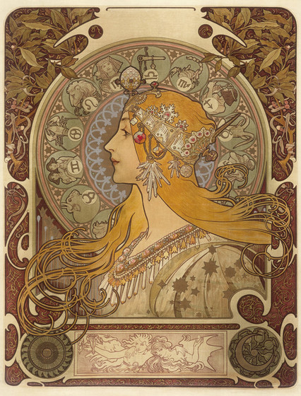
Mucha himself was deeply interested in astrology and the occult, perhaps explaining why his imagery lent itself so easily to adaptation for ’60s-era psychedelia. Like Maitland, Max undoubtedly saw Mucha’s work as an embodiment of timeless beauty—one that he could update for his own moment in a gesture that reads as both sweetly nostalgic and intensely contemporary.
This post is the first of a two-part series on the legacy of Art Nouveau; Part Two picks up in 1970s Japan, where psychedelia, Art Nouveau, and Japanese woodblock prints collide. Apostles of Nature: Jugendstil and Art Nouveau is on view at LACMA through April 23, 2017.


