In 1984, Apple Computer released the Macintosh, a desktop computer with an intuitive graphical user interface. This invention spurred a period of rapid innovation in digital design tools, radically altering the practice of graphic design. Over the next decade, the design process shifted from a meticulous craft of drawing, cutting, and pasting to a largely screen-based activity. While designers had once relied on an ecosystem of skilled professionals such as typesetters to help them realize their work, over time, advances in software made it possible (and expected) that design offices would absorb these tasks.
The documentary Graphic Means: A History of Graphic Design Production, which will be shown at LACMA on January 15, explores how the methods and tools of design shifted from the analog production of the early-to-mid 20th century through the digital revolution.Through interviews with designers as well as production experts, the film reveals how these changes in technology impacted gender roles and other social dynamics within the field.
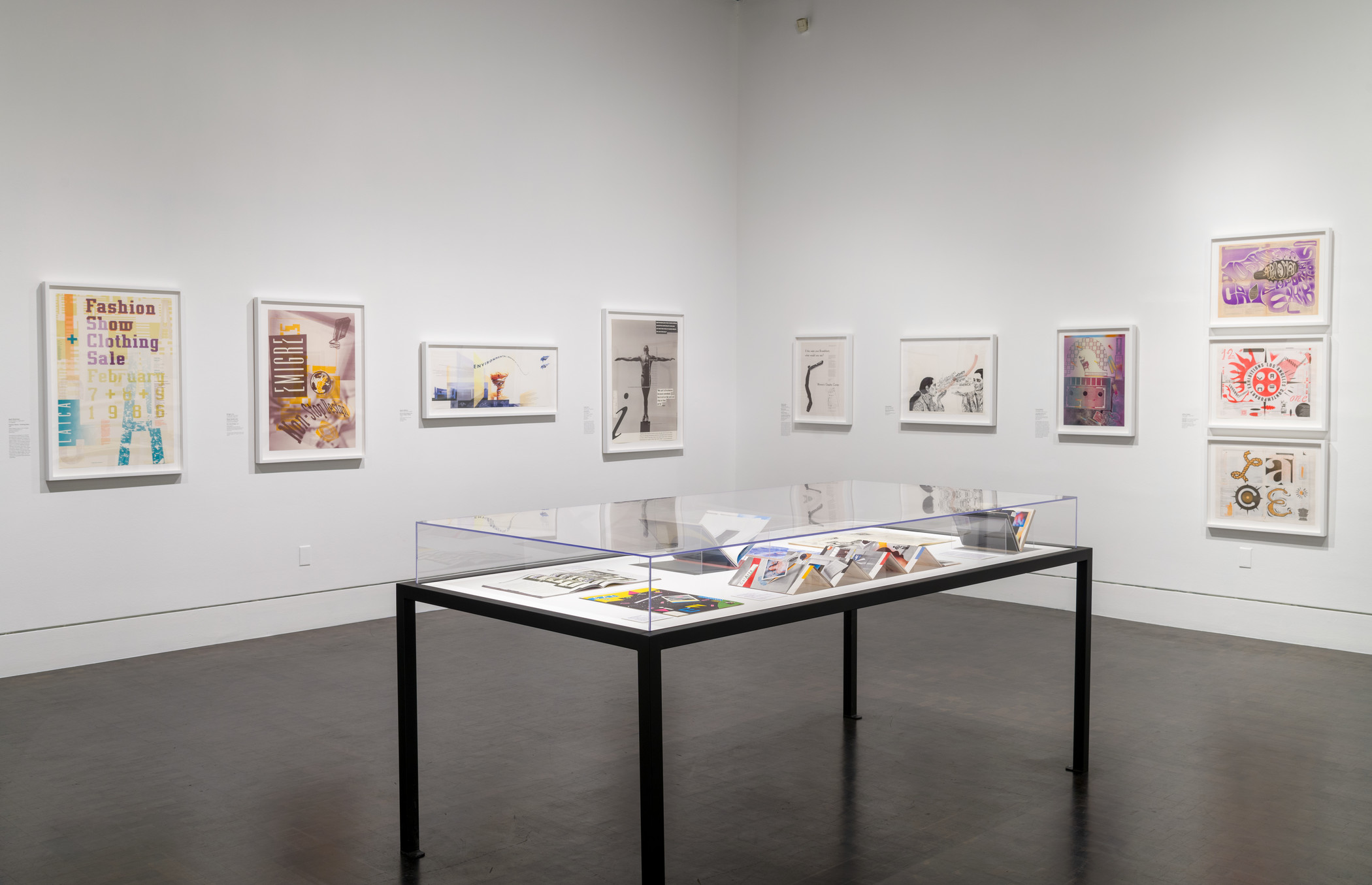
LACMA will be screening Graphic Means in conjunction with the exhibition West of Modernism: California Graphic Design, 1975–1995, now on view in the Ahmanson Building. The introduction of the Macintosh falls neatly in the middle of the two decades covered in the exhibition, but as the works on view reveal, the change in production was by no means instantaneous.
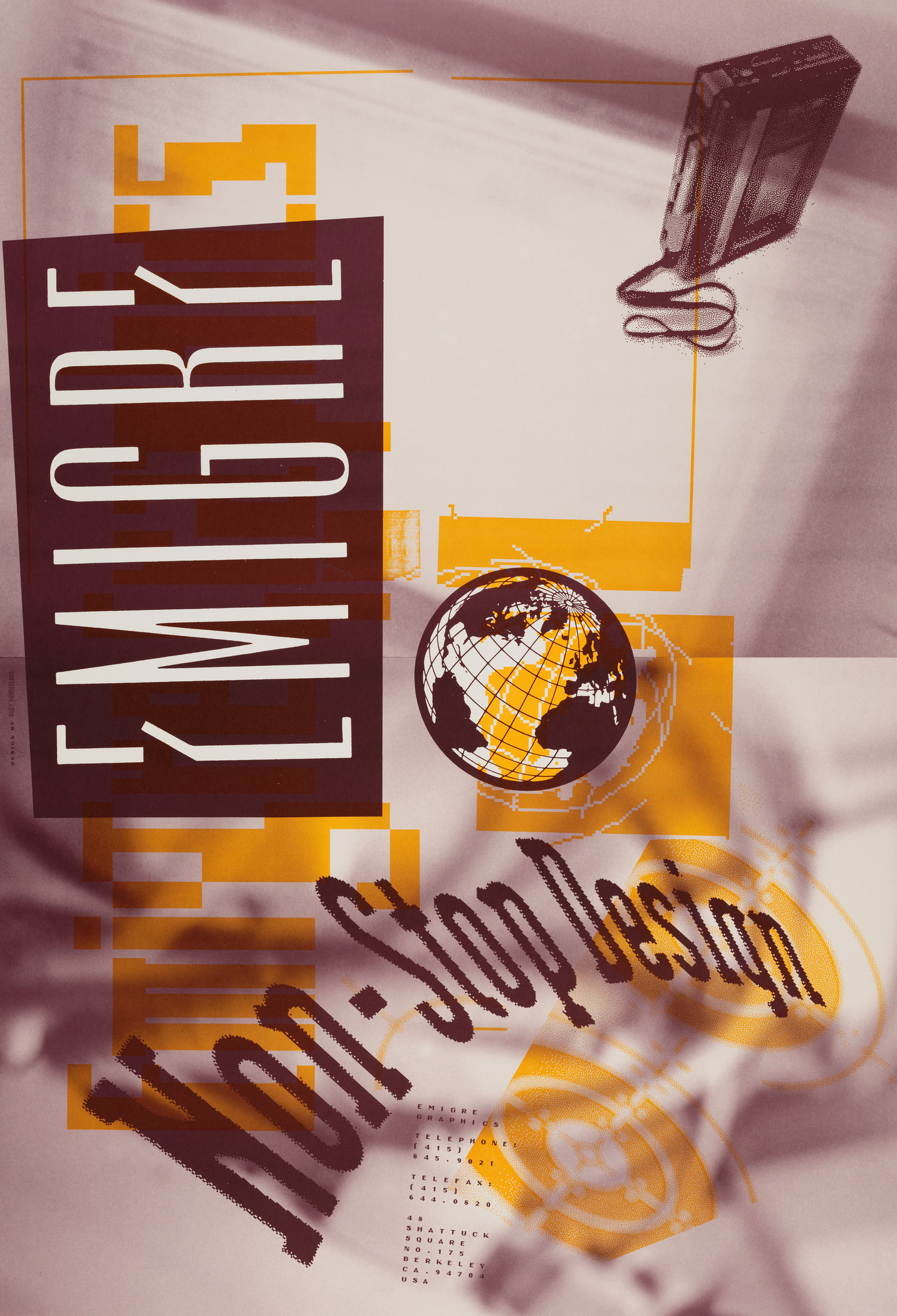
While some designers eagerly installed the new machines in their studios, many kept their distance. They expressed skepticism of both the alien contours of the pixelated images and the unfamiliar way of working. In 1989 Emigre magazine, whose founders Rudy VanderLans and Zuzana Licko were among the digital pioneers, captured this ambivalence with issue dedicated to the Macintosh titled “Ambition/Fear.” The magazine, like many of the works on view, was made with a combination of digitally produced material and analog reproduction techniques.
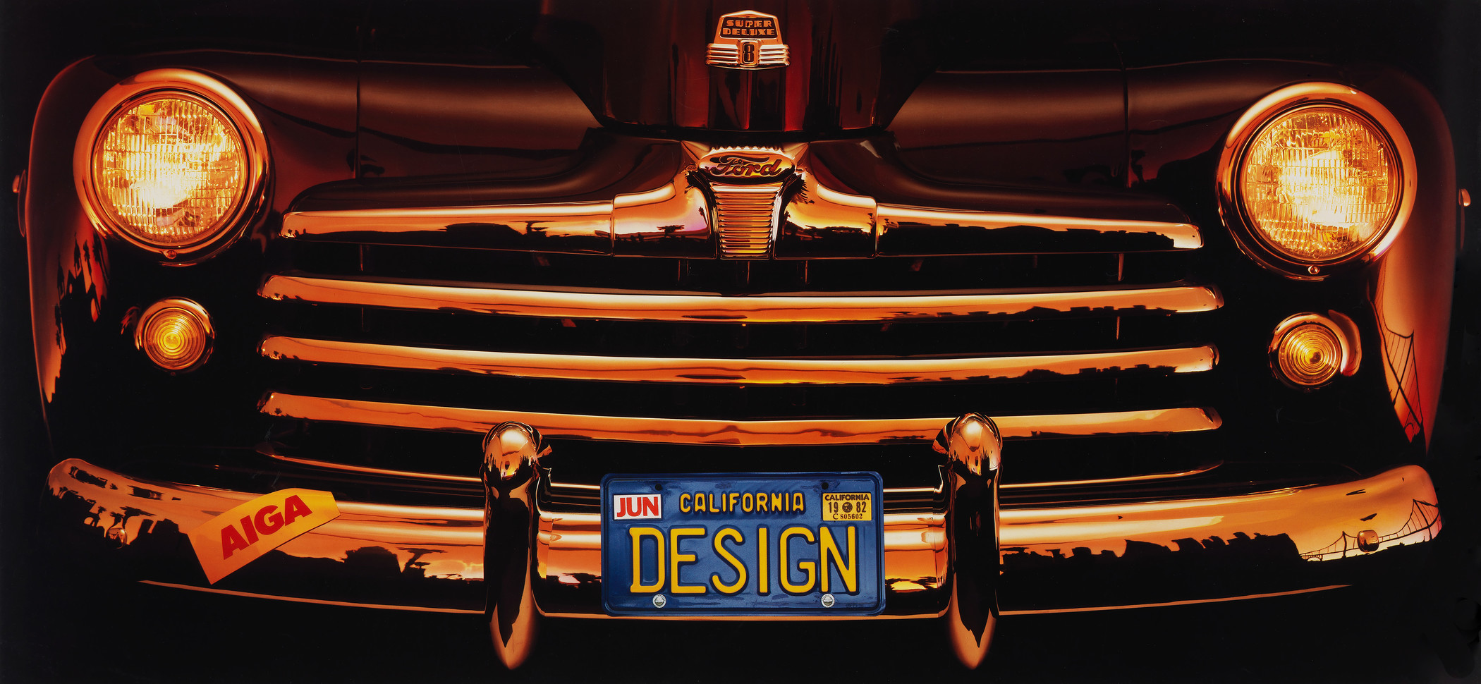
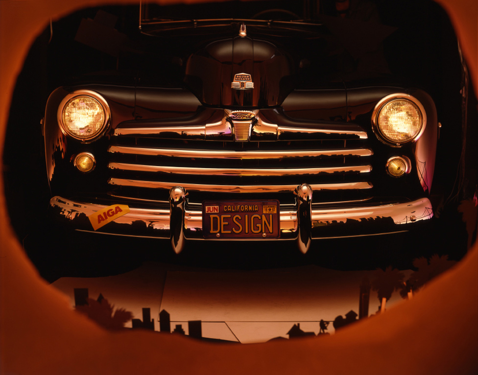
In anticipation of the screening, I spoke with two designers about how they created the works on view in West of Modernism. Kit Hinrichs of San Francisco describes himself as “an obsessive narrative designer,” and often uses vivid photographs of popular material culture and Americana to tell his stories. His 1983 poster AIGA: California Regional Call for Entries appears deceptively simple. Further examination, however, reveals how carefully Hinrichs constructed the image in order to capture the Golden State ideal in a single shot—without any digital manipulation.
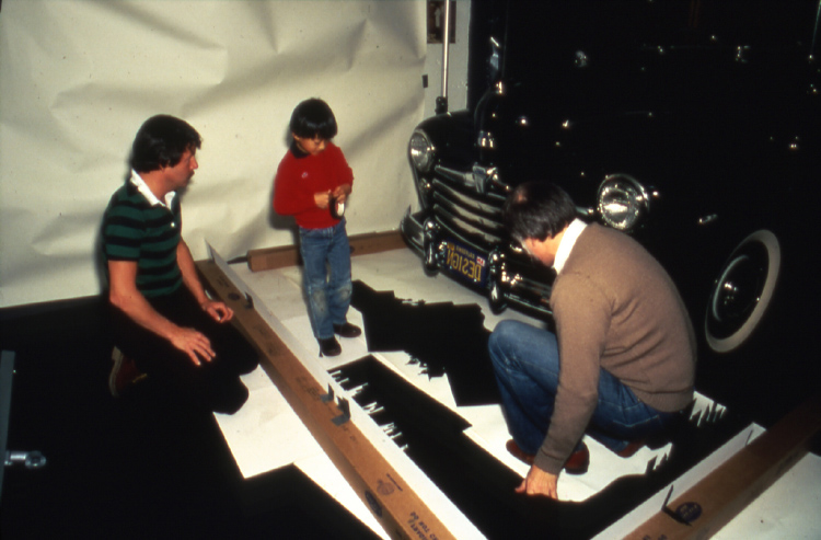
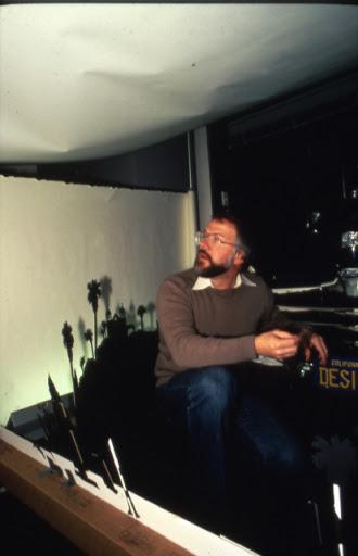
According to Hinrichs, “Our job was to present all the state’s expected imagery in an unexpected way.” The question became “Can we present the overwhelming automobile culture, palm trees, historical and contemporary architecture heritage, and envision the endless possibilities held by those lucky enough to live out here, all in single image?” He started by negotiating the loan of a classic Ford—no easy feat during a rainy year—as well as tracking down the AIGA member who had actually registered her car with a “Design” vanity license plate. With the help of his young son and photographer Terry Heffernan, he constructed a fantasy skyline that united landmarks from across California, incorporating the Golden Gate Bridge and the Franciscan missions alongside palm trees and L.A.’s City Hall.
They mounted the silhouette around the front bumper, then backlit the car with strobe lights and colored gels in imitation of a glowing sunset. In order to make the license plate stand out, they shot it separately “sans sunset lighting,” and then stripped it into the original photograph.
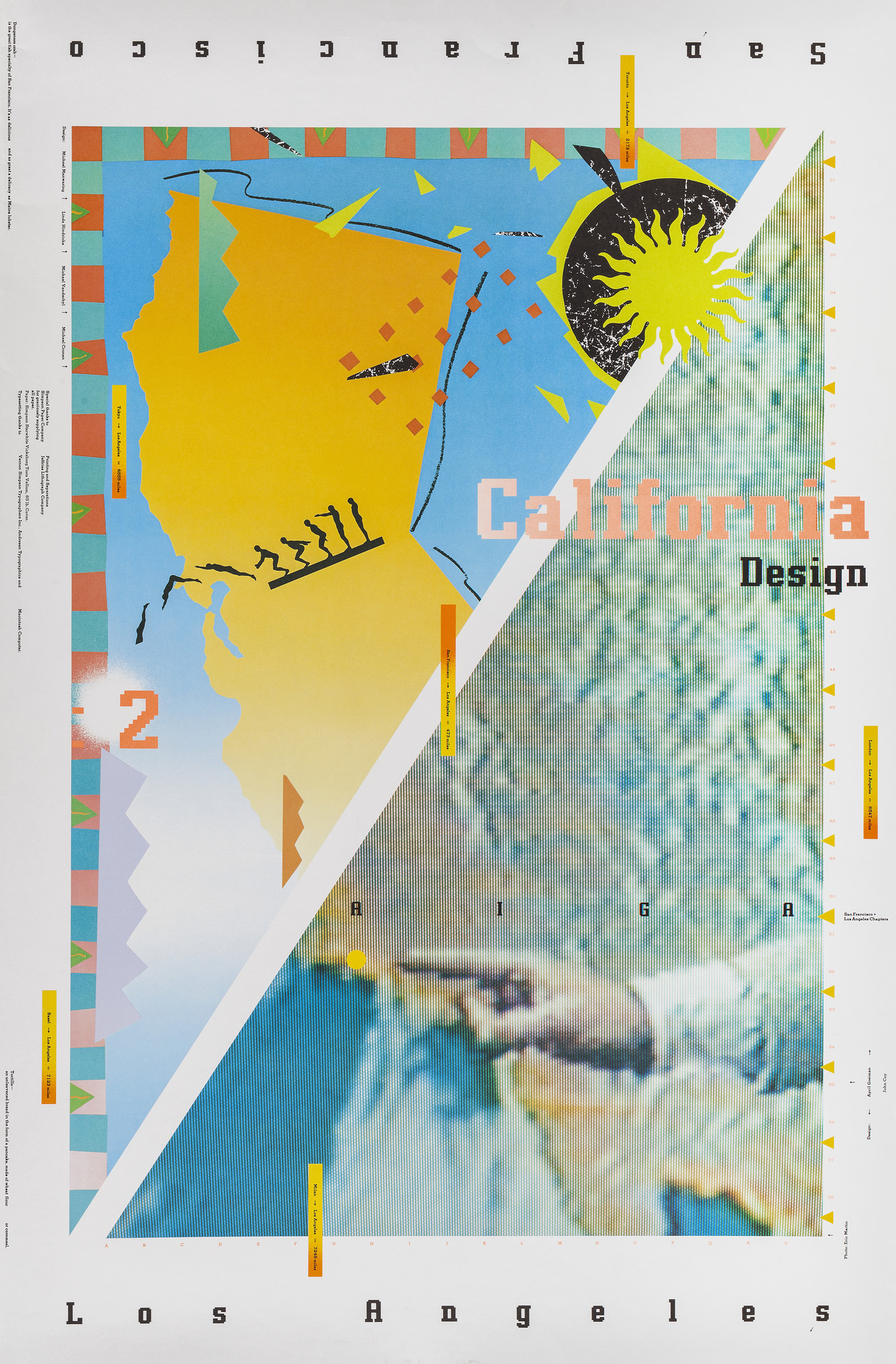
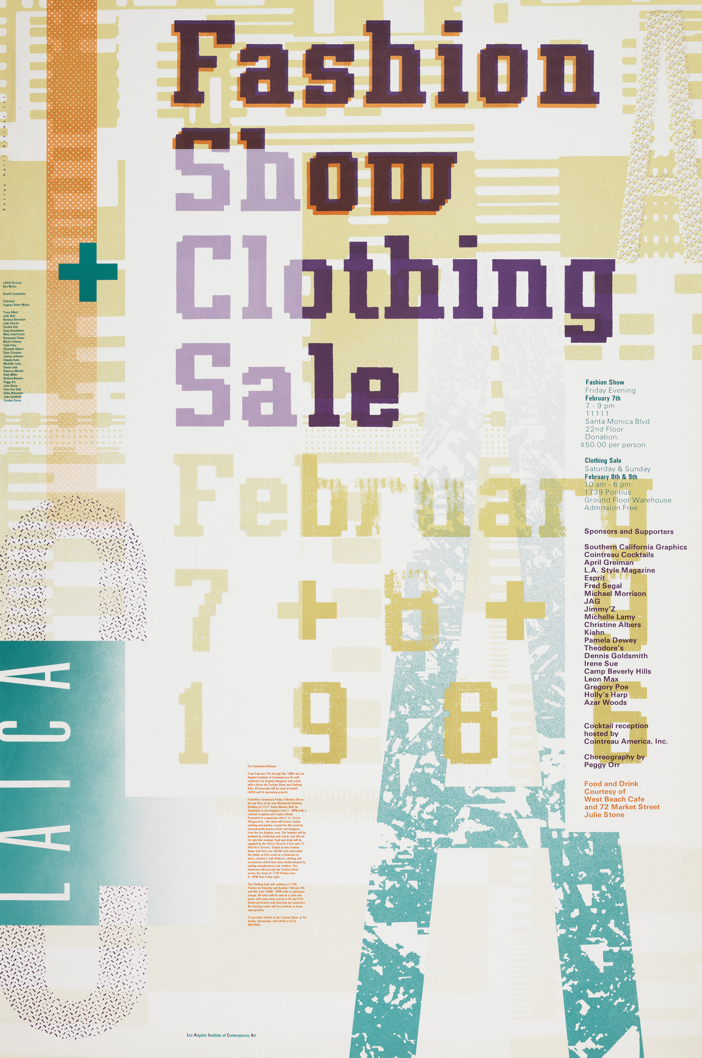
In contrast to Hinrich’s intensely physical process, April Greiman embraced digital tools in the production of her 1986 poster for the Los Angeles Institute of Contemporary Art (LAICA). Deeply interested in the “texture of technology,” Greiman had already been experimenting with videographic imagery (as seen in the lower half of AIGA California Design 2) when she bought her first Mac in 1984. Fashion Show + Clothing Sale was the first time she used output from the computer on a final product, layering digitally-generated patterns and gradients to suggest fabric. Her oversized headline text valorized jagged, bit-mapped fonts, but she relied on conventional typesetting for the smaller copy and logo. She created the final production art—or “mechanical”—by physically assembling print-outs of both the digital and analog pieces to prepare them for photography.
While Greiman celebrated what she called “hybrid imagery,” she saw fully digital design as the ultimate goal. In a recent interview, she argued that every minute invested in cutting and pasting was a minute that could have been spent on further developing creative work. That same year, she would literally become the poster child for computer imagery, publishing an iconic double-self portrait that was composed on the screen and then printed as a single image.
Greiman is one of the designers featured in Graphic Means. Join us on January 15 to get the bigger picture of how graphic design production evolved over the 20th century. There will be a Q&A with director Briar Levit following the screening.


