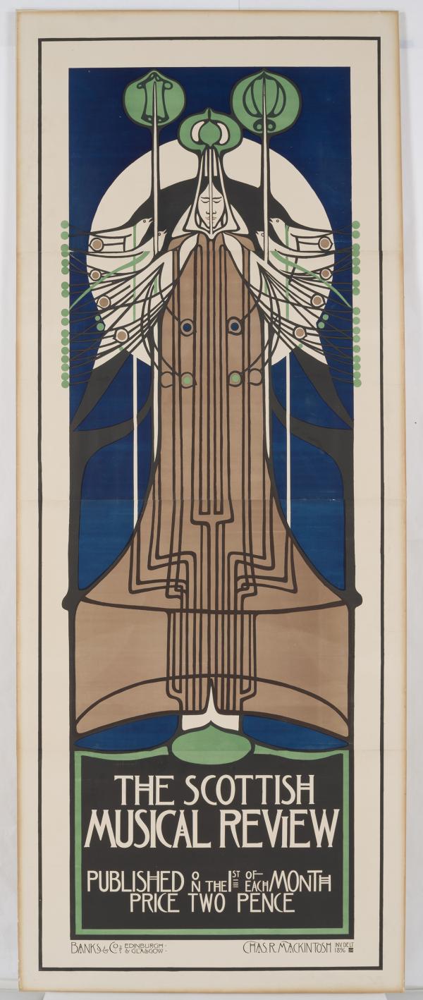
You might not think about it, but works on paper can be quite large! Oversized artworks needing conservation require many people with diverse skills to complete the treatment. A decorative arts poster from 1896 designed by the renowned Scottish architect Charles Rennie Mackintosh recently received such extensive treatment, which involved six members of LACMA’s conservation staff and lasted almost a year!
Mackintosh designed this poster for the Scottish Musical Review in 1896, the year he submitted the plans for his most famous building, the Glasgow School of Art. In his imagery human, plant, and bird forms are integrated into abstract patterns illustrating Symbolist themes of spiritual transformation, decay, and renewal. One of only about 10 examples known to survive, this example was the first to come on the market since the 1970s.¹
The poster is nine feet long and consists of four separate panels joined together. Prior to its accession into LACMA’s collection in 2014, it had been lined overall with a canvas textile and stretched onto a wooden strainer for framing, similar to a painting. While this technique is somewhat common practice for oversized works on paper, it does not always ensure the safety of the object over time, as each material in the multilayered structure responds differently to environmental conditions like humidity. This can cause differences in tension and lead to tears or cracks in the thin paper support in severe cases.
The Mackintosh poster featured such tears and cracks, and the Paper Conservation team decided to remove its poorly executed lining and reline the object for its safety. This was no simple undertaking, and after many consultations with the Decorative Arts curator the paper conservators began the intensive treatment.

The poster’s textile lining was first removed from the wooden strainer, then humidified overall to soften the starchy paste between the poster and the lining. This technique ensured that the textile could be gently peeled off the back of the poster without damage. The four panels were separated in a similar manner to facilitate better cleaning in the next treatment steps—bathing something that is 38”x 24” is much easier than bathing something that is nine feet long.
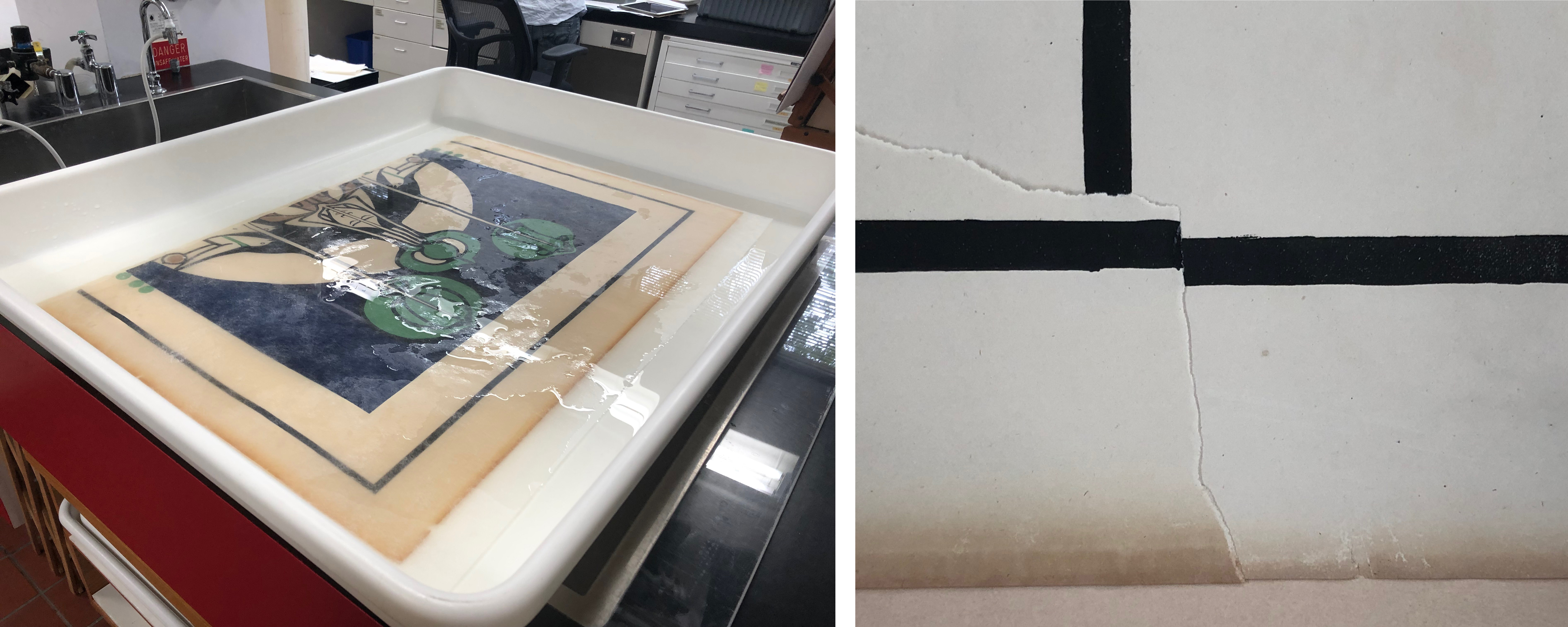
Each panel was bathed first in filtered water at a neutral pH (7), then again in a slightly more alkaline bath (adjusted to pH 8 with calcium hydroxide). This is done to counter the acidic nature of paper and redeposit lost calcium ions back into the sheet, a common practice for paper conservation. Bathing the paper helps to remove water-soluble degradation products like acids and the chemical components responsible for yellow discoloration. After this portion of the treatment, the paper was much brighter and less brittle and yellow.
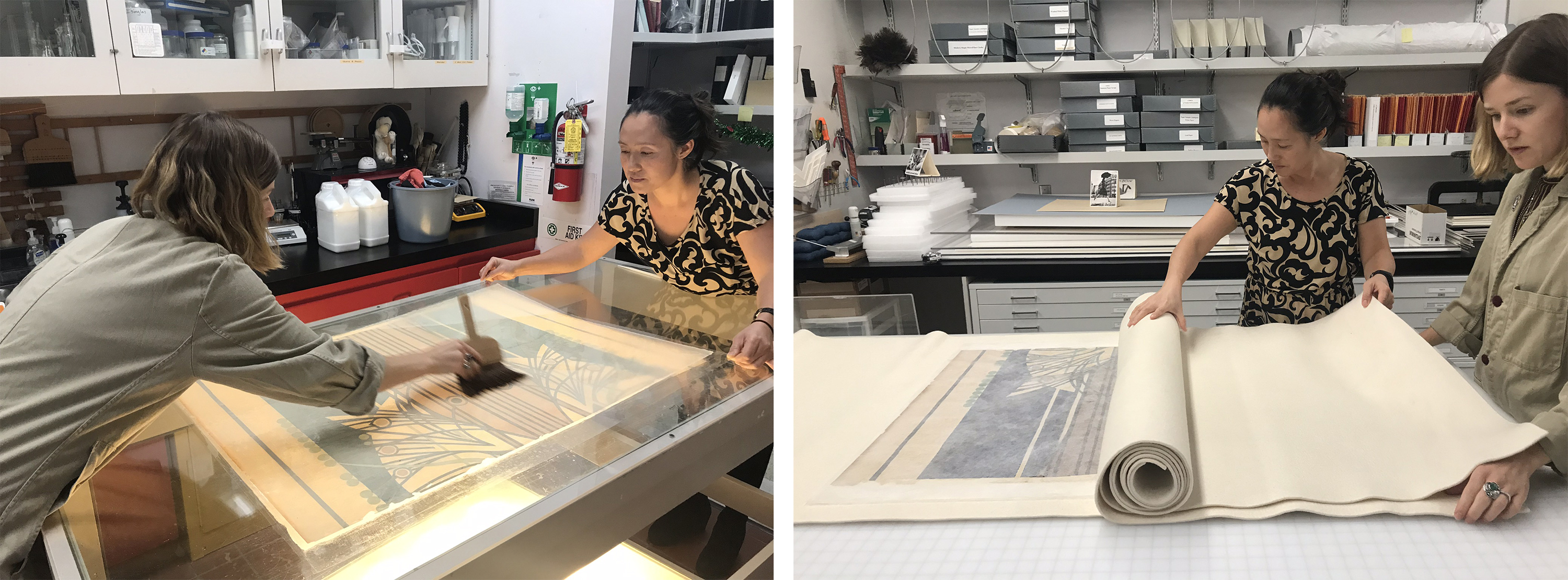
In order to be rejoined and made safe for future display, the poster was relined with better materials than before. Japanese paper is thin and flexible but very strong, and wheat starch paste does not discolor, remaining water soluble even after hundreds of years. Therefore, a sheet of Japanese paper was attached to each individual panel with wheat starch paste, and then dried.
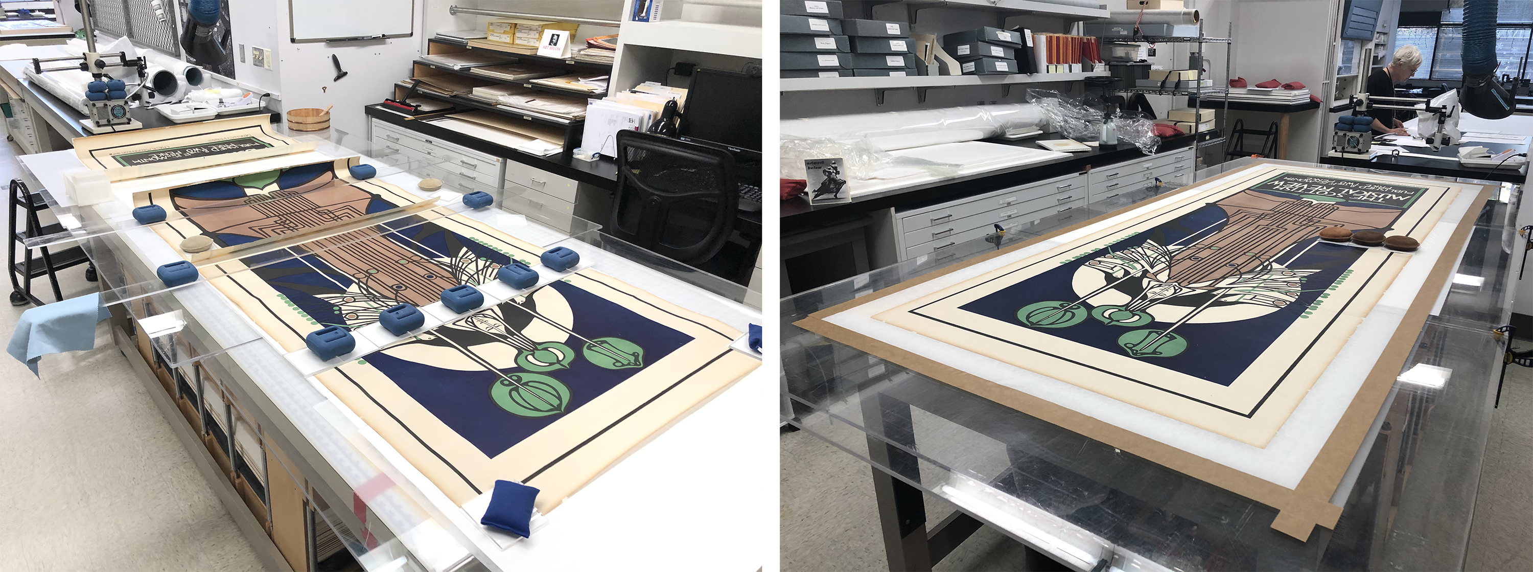
The panels were rejoined with paste and dried, then the entire object was lined a second time with Japanese paper and paste. The lined poster was dried for many weeks under slight tension to keep it planar.
The excess lining paper at the edges was used as hinges to attach to a specially prepared rigid paper board with a honeycomb-shaped corrugated interior. This board is lightweight but strong, and was used in the final framing of the poster. Final touches of inpainting with reversible watercolors finished up the treatment, and the completed poster was sealed in its custom frame!
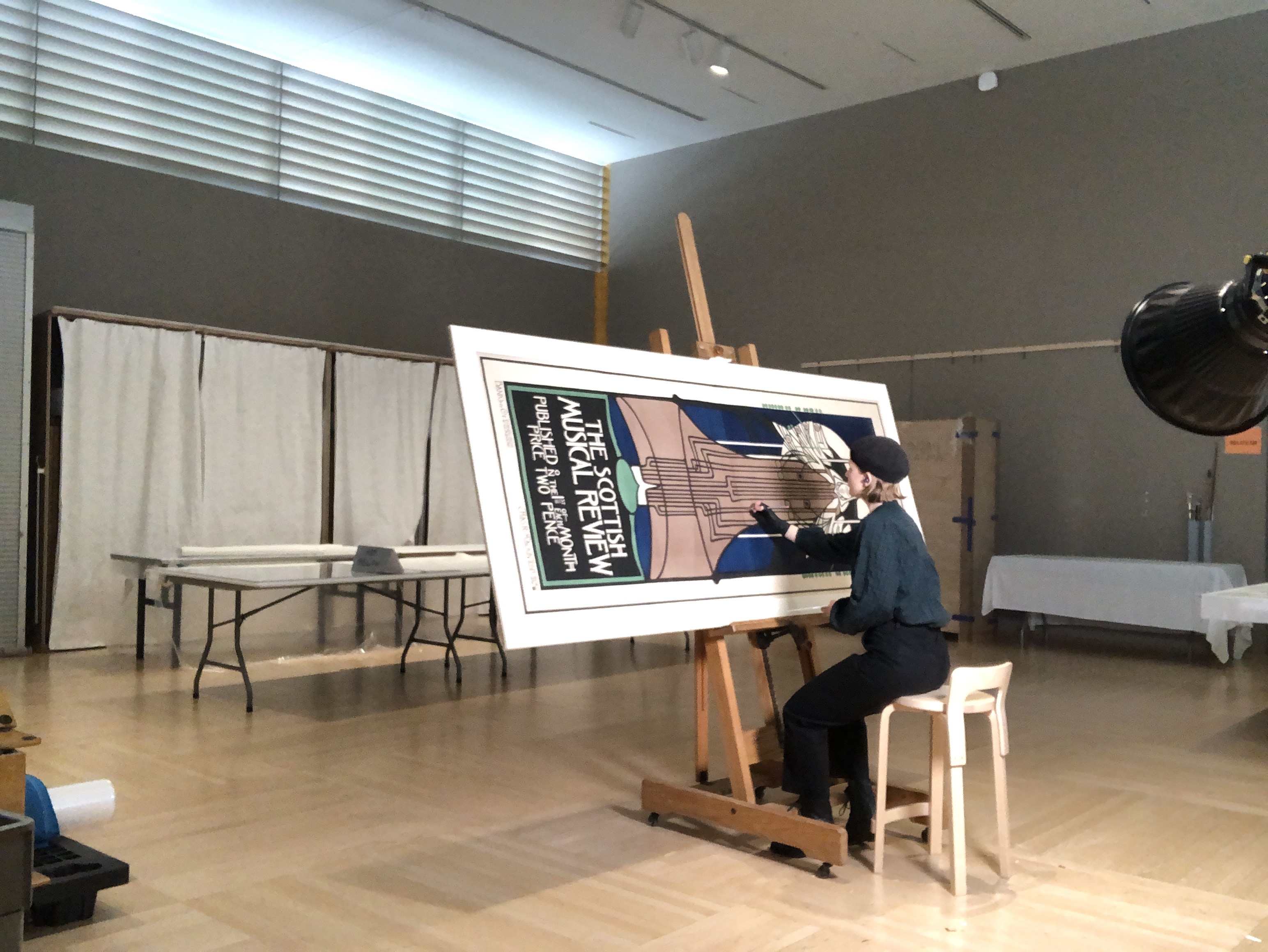
This was a rewarding collaboration, involving many people from the Conservation department, the Paper Conservation technician, and the matter/framer. Without this teamwork the treatment could not have been successful. Such intensive treatments are excellent opportunities for creative problem solving and will enable LACMA to share with the public what is considered the most outstanding example of Mackintosh's graphic design.
¹ Wendy Kaplan, Department Head and Curator, Decorative Arts and Design


