Later this year, more than 70 cultural institutions across Southern California will be participating in Pacific Standard Time: LA/LA, a far-reaching and ambitious exploration of Latin American and Latino art in dialogue with Los Angeles. We went behind the scenes with associate paper conservator Erin Jue and assistant curator of decorative arts and design Staci Steinberger to take a look at some of the posters that are being treated in advance of the exhibition Found in Translation: Design in California and Mexico, 1915–1985. The exhibition, co-curated by Staci and Wendy Kaplan, department head and curator of decorative arts and design, opens at LACMA on September 17.
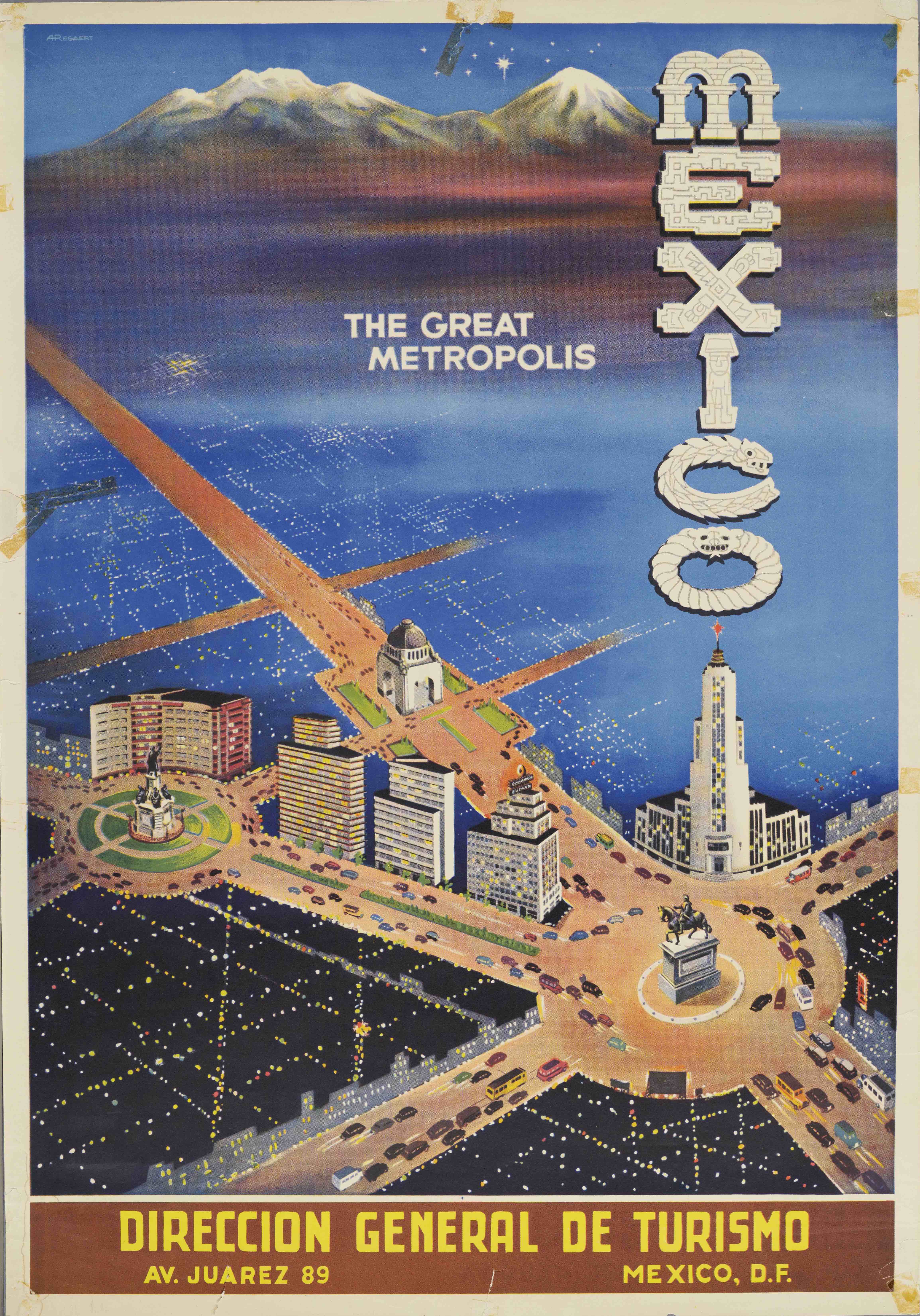
This exhibition is a groundbreaking exploration of design dialogues between California and Mexico. Its four main themes—Spanish Colonial Inspirations, Pre-Hispanic Revivals, Folk Art and Craft Traditions, and Modernism—examine how modern and anti-modern design movements defined both locales throughout the 20th century. It tells this story through architecture, furnishings, ceramics, metalwork, textiles, costume, jewelry, mural studies, photography, paintings, sculpture and, as you’ll see below, graphic design. Posters play a key role in the exhibition, demonstrating how ideas and images were communicated across the border.

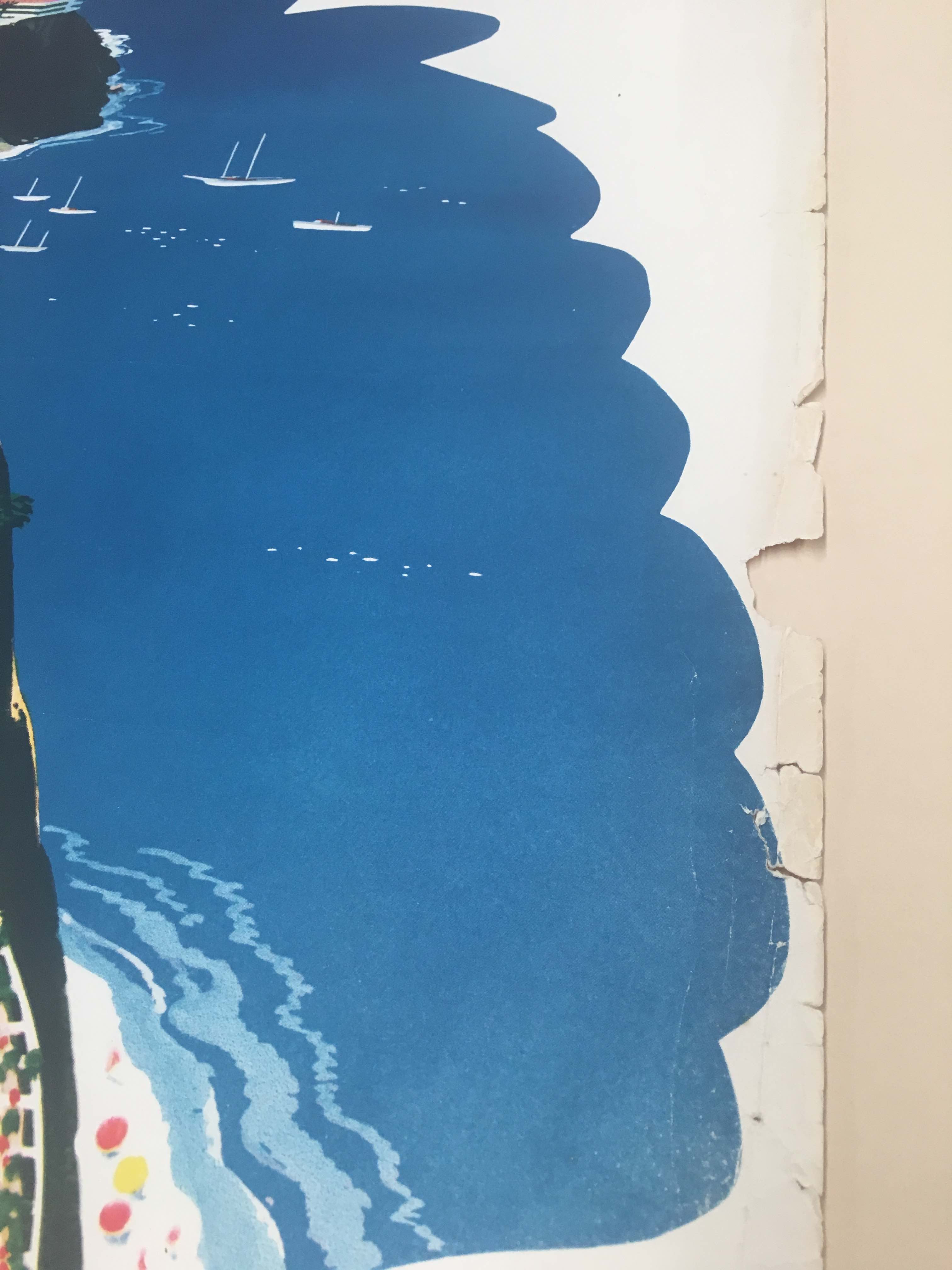
This American Airlines poster, designed by California designer Fred Ludekens, has many breaks and losses. Advertisements like this weren’t meant to be art objects, which means they weren’t printed on high quality paper and often weren’t preserved very well. This kind of damage can be fixed with very thin Japanese paper (in this case Tengujo), attached by wheat starch paste, which is cooked by conservators in the lab every week.
Erin will add a piece of paper to fill the loss, having located a type of paper that is similar in thickness, opacity, and color to the original. Sometimes, when an appropriate type of paper can’t be located, conservators will make their own paper in the lab.

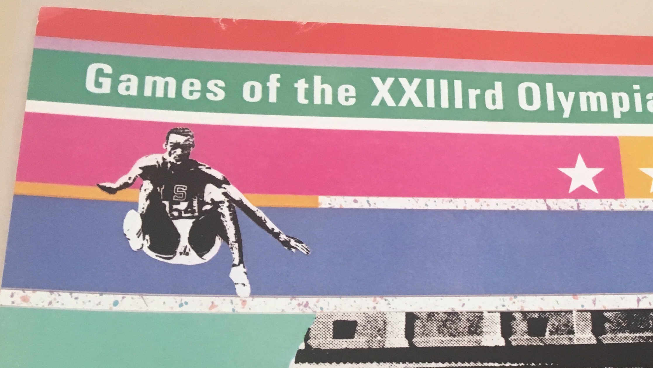
This poster was designed by Deborah Sussman and Stephen Silvestri from the firm Sussman/Prejza & Co. Sussman described how the bold colors she chose for the 1984 Los Angeles Olympics reflected “the colors of celebration” she’d seen in her travels across the Pacific Rim, including in Mexico. In the exhibition, we show artifacts from the 1984 Olympics in dialogue with those from the 1968 Olympics in Mexico City, exploring how designers in both places used innovative graphics to unify their famously de-centralized metropolises.

Though in good condition, there is a little damage on the top of the poster; Erin will in-paint with watercolor to match the vibrant colors of the poster.

Part of the conservator’s job is to figure out what kind of printing process was used. One way to do that is to use a binocular microscope and look at the morphology of the dots that make up the image. From its fuzzy edges and even distribution of ink, Erin determined that the poster is a lithograph. That information will go in the publication as well as on the exhibition label.

Rodolfo “Rudy” O. Cuellar, part of the Sacramento-based art collective Royal Chicano Air Force, incorporated an image by Mexican artist Adolfo Mexiac into his poster Humor in Xhicano Arte. This poster is in good condition, with discoloration along the edges and minor breaks. Though the discoloration can be washed out, Erin plans to leave it as is because the image is in good condition and the damage at the edges will be hidden by a mat.
Learn more from Erin and Staci as they talk in depth about the conservation considerations and the art historical context of these objects!
Found in Translation: Design in California and Mexico, 1915–1985 will be on view at LACMA from September 17, 2017 through April 1, 2018.


