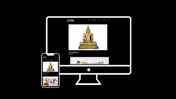
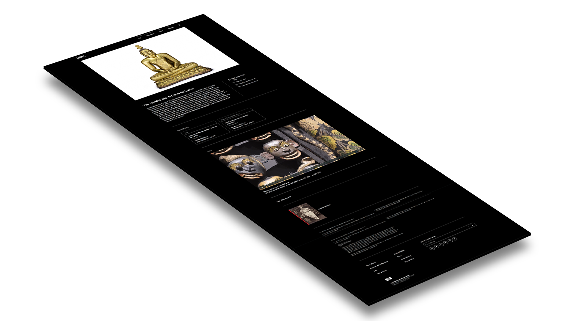
After more than a year of research, design, and development, we’re excited to share our new website. Re-envisioned for the first time in over a decade, the site focuses on mobile-first utility and simplification to better connect our audience to the wide range of cultural offerings that LACMA presents on campus and around the world.
Since our last website redesign, the internet has come a long way. Platforms like Google and Facebook have re-engineered the way people browse and discover content, mobile devices have altered the format through which the web is experienced, and refined visual and technical standards have established universal expectations on user experience.
In designing the new site, the core objectives were identified and developed through many rounds of analytic assessment, user survey, and prototyping. Last year more than half of web traffic to lacma.org was viewed on mobile devices. As a result, we envisioned the site experience first in mobile formats before expanding to desktop. Interface decisions were dictated by similar objectives, prioritizing clarity, utility, and accessibility. These values resulted in the selection of a mobile-friendly “dark mode” color scheme that helps reduce mobile battery drain and user eyestrain. We’ve included a toggle in the footer of the site for those who prefer a lighter palette.
Alongside content and interface changes, we’ve greatly simplified the site architecture. This simplification enabled us to add new tools and digital resources without the clutter of complicated menu structures. As you navigate the site you can expect to find improved access and information for a number of our highly trafficked content areas, including:
- Exhibitions. More information about current exhibitions and installations, access to a larger group of past exhibitions, and a wider window into what’s coming soon.
- Calendar. An improved search and filter interface, allowing visitors to effortlessly discover LACMA programs and events at the museum and across the county.
- Search. Suggested results and smarter filters enable quicker access to query results.
- Publications. An evolving roster of LACMA’s exhibition catalogues and where to find them: online, in libraries, and at the LACMA Store.
- Art + Tech. Greater access to the current and past artists included in LACMA’s Art + Technology Lab, and full access to project documentation.
With the addition of these new content areas came the reconsideration of existing content. LACMA’s video productions have been relocated to YouTube, where we’re leveraging their powerful algorithm and search capabilities to connect viewers to the museum’s video content. Each month we’re featuring a playlist of videos that explore artists and exhibition themes in-depth. These playlists collate LACMA’s original productions and videos from trusted content producers around YouTube. This month’s playlist centers around the exhibition Outliers and American Vanguard Art, bringing together documentaries, artist films, and conversations with curators and artists that are shown in the exhibition. Subscribe to our YouTube channel for updates.
As we evaluate analytics, user patterns, and feedback on the new site, we will continue to adapt and improve to achieve the best experience for online visitors. Ongoing digital initiatives will also result in increased visibility of past exhibition content and a redesign of our online collections website. These projects will fully embrace LACMA’s mission to maintain transparent access to the museum’s research and collections in an effort to translate them into meaningful educational, aesthetic, intellectual, and cultural experiences for the widest array of audiences.
We hope the site will serve as a valuable channel to connect you to all of the exciting exhibitions, programs, and events at LACMA. If you have questions or comments, feel free to visit the website section in our FAQ hub, or drop us a line at lacma.org/feedback.
Thank you for your feedback and patience through our continued effort to improve your digital experience of LACMA. We’d also like to thank our development team, Urban Insight, and our creative technology consultant, Stink Studios.


