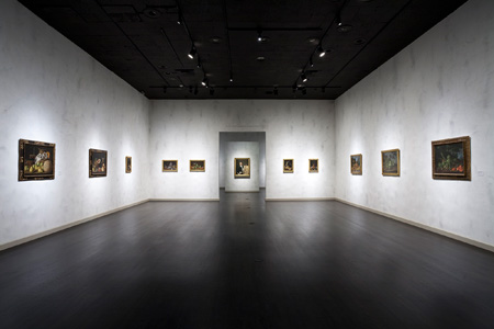
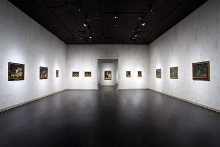
Lately, writers have taken notice of an unusual feature in our Luis Meléndez show—the treatment of the walls. It’s true; these definitely do not fall into the default-white category.

Curator Patrice Marandel took a more atypical route in his installation of eighteenth-century Spanish still lifes, envisioning a contrast between the finish of the paintings and the roughness of the walls. The effect was created by contractors with the direction of exhibition designer Bernard Kester, who noted that the challenge was, “How to make the walls look good and ancient when they’re really brand new.” He achieved his goal by selecting a coarse plaster (vs. paint) to cover the walls, followed by a more refined plaster applied “casually” so as to appear unstudied, then paint in “an old fashioned white suitable for the attitude of paintings.” The dark glints that emanate here and there are the uncovered, raw first layer of plaster showing through. I asked Bernard what he calls this technique, which may be repeated in the medieval galleries when the European art reinstallation is complete next year. His response—“Messing around, I’d call it.”


