This week members are getting their first look at the Resnick Pavilion, and this weekend the museum will be free to everyone as we officially open the new building and its three exhibitions. On the occasion of the new addition to the campus, I talked with LACMA’s director, Michael Govan, about the building.
We launched Unframed the day LACMA broke ground on the Resnick Pavilion, so we’ve been keeping our eye on the building’s progress for a couple of years now. How do you feel about the process and the outcome of the building?
I think the results are, for me, spectacular. The building is more than a building: it expresses a lot of the fundamental ideas about the future of the museum and the definition of the museum.
How so?
I wanted a place where the whole mission of the encyclopedic museum—the patchwork of cultures, the art of all time—could be in one place. That’s what Lynda and Stewart Resnick wanted as well. As collectors and as patrons, the Resnicks admire and support art and artists from all times and cultures, and this building fits that sensibility. A lot of other buildings and spaces are made for one type of art, but people who don’t like that type of art—who don’t think they like it—won’t set foot in them. The Resnick Pavilion is about mixing art of different times and places, but for me it’s just as important to mix audiences, and to take forward this idea that we have a town square, that the audiences will mix.

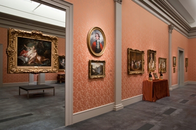
Installation view of Eye for the Sensual
What is it about the Resnick Pavilion that carries that idea forward better than other buildings?
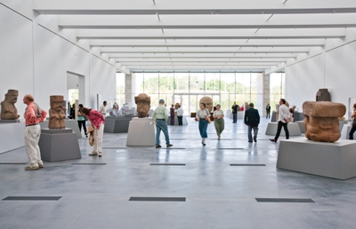
It’s a combination of being on one floor plate and containing a constantly rotating slate of exhibitions. Because it’s on one floor, people run into each other. It’s not like they go to the second floor on the elevator and then come back down and leave. You might come for Olmec but become tempted by the costumes of Fashioning Fashion; or you might want to see the European paintings in Eye for the Sensual but you must pass through Olmec to get there. The hope is that all of the exhibitions will pique your curiosity, regardless of which one you came for. And along with that there will be the energy that comes with all of these exhibitions’ audiences being, basically, in one place together.
And this is the case not only for the inaugural exhibitions but also all exhibitions going forward, right? There will always be this kind of juxtaposition of genres and eras.
Yes. The beauty of Renzo Piano’s design for the Resnick Pavilion is its flexibility. Because it’s all on one level you can pick the size for your exhibition; you don’t have to be bound to a box of a certain size, which is true of almost all of our other spaces. You can adjust those spaces for big shows and little shows and have a much more agile mix. And of course the other benefit of being on one level is that you get natural light throughout.

Members inside the Olmec exhibition
The light is definitely a major feature of the new building, and of Renzo’s overall vision for the campus. The third-floor galleries are my favorite part of BCAM because of the light, but in the Resnick Pavilion it’s even more pronounced, thanks to the all-glass north and south facades.
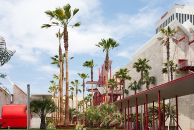
Renzo is a master of light, and that’s what I wanted first and foremost—a great feeling of light in the building. Renzo was the perfect architect because his father was a builder. He talks about buildings as machines. He talks about how you build them bit by bit; he exposes the mechanics. But it’s also about the relationship between inside and outside, the museum and the park. Robert Irwin’s precise organization of palm trees are almost an extension of the architecture, mediating between the grid of the galleries, the grid of the city, and the natural environs of the park.

Palm trees in between the Resnick Pavilion and BCAM
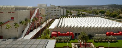
Speaking of Renzo’s approach to the “building as machine,” one of the ideas behind his buildings at LACMA seems to be to get everything outside of the buildings—like the air ducts on the side of the Pavilion, or the escalator outside of BCAM—so that there’s more room for the galleries.
Exactly. It’s supposed to be all about its content. It’s not a value judgment, but it’s the flipside of a building like Frank Lloyd Wright’s Guggenheim in New York—it’s the opposite of a building as sculpture. The Resnick Pavilion’s greatest homage is to the industrial buildings of the 1920s, which were extremely functional for people as well as for work to get done. For years in the museum field, so many of my colleagues talk about the fact that really the best spaces for art are old factories renovated to show art. And yet nobody builds them new with the same qualities of simple open space and light.

Exterior
There’s an impulse, I would imagine, to make the building itself an artwork—to make it a museum piece.
Renzo’s buildings are about what’s inside. For me, museum architecture is not mainly about what a building looks like as an artwork—although of course it can be one; it’s about the comfort and the feeling and the accessibility the building provides to have the fullest experience of the artwork. I know that sounds sort of traditional, but it is my real belief. And I think that while people say that often, they don’t build buildings that do that. A simple example is there are so many artworks that don’t want spotlights, that don’t want theatrical lighting. They want even, overall, natural light. Other than Renzo Piano’s buildings, it’s hard to find museums that do that.
When we had installed Walter De Maria’s The 2000 Sculpture over the summer as a “test run,” there were no interior walls at all; the light in the building was palpable. I had a chance a few weeks ago to get into the building now that the current gallery configuration is in place for the three inaugural exhibitions. I worried that it would lose that wow factor, but to the building’s credit it still feels very spacious and open.
You’ll see it looks bigger with walls. I was talking with LACMA’s John Bowsher, who was a less-visible collaborator on the building—I’ve worked with him for many years; he’s one of the great experts in the world on exhibition design and thinking about museum space. We were talking about how this building can take anything you can throw at it, and take it with ease and look elegant and comfortable.
For the opening, we’re throwing the hardest problem at the building. It’s risky—ancient Mexico, Fashioning Fashion, and the Resnick Collection—three extremely diverse exhibitions that have very different design and light and space requirements. My view is that if we pass that test, then the building will prove its incredible versatility and durability.
You’ve got a lot of museum-building experiences under your belt; how has the process of building the Resnick Pavilion been for you?
I’ve worked helping to design museums and build them for twenty-two years. I’ve worked on at least twelve major projects, ranging from Williams College to Bilbao to the factory renovation at Dia. This is the first chance I’ve had to guide the design of a building from the ground up.
So it’s especially gratifying to see it open this week.
Well, it’s especially terrifying. Gratifying will hopefully come later. It’s been especially terrifying, that responsibility, after you’ve worked on so many museums and think you should know what should and shouldn’t be done and have lived through mistakes and opportunities. I did feel it was an awesome responsibility to try to get it right. So I hope it’s right; I don’t think you can tell that until time takes its course, until many shows have been there; until artists, curators, and designers have challenged it—and until the public has had a chance to trip over the stairs.
That’s right—there actually were stairs at the front entrance, which have now been converted into a ramp. That might have been the most beneficial thing about the De Maria “flash visits.”
That was the idea behind the flash visits—to fiddle with the building, to see what it could do. It was a pleasure to have that extra time and make some corrections, like the stairs. And again to work with an architect of Renzo’s stature and experience; to work again with Robert Irwin, who is an artist of incredible experience and capability; to work with Melody Kanschat [LACMA president], who is an ace museum-builder; and John Bowsher and the huge team of experts who contributed to the result—it was just a super exciting experience to try to meet this mission. Perhaps best of all was the incredible confidence and encouragement Lynda and Stewart Resnick gave all of us to create this space with our best judgment. In the end I think everyone is really pleased with the pavilion. I look forward to seeing what our members think this week, and especially to officially opening the building to the public this weekend.


