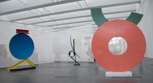
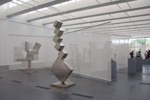
David Smith: Cubes and Anarchy opens at LACMA this Sunday (on view starting tomorrow for members). Curator Carol S. Eliel calls Smith one of the greatest American sculptors of the twentieth century—we’ll have more from Carol next week on Unframed. First, we asked Brenda Levin of Levin and Associates Architects for a sneak peek at her design for the installation.

David Smith installation at LACMA
In what ways did Smith's work inspire your design?
Our design was inspired by Smith’s own exploration of space and form. He often layered the placement of his sculptures in relation to each other to create a new art form through photography and what he called collages in space.

Geometry is an important theme in this exhibition. Does it play a role in the installation design as well?
Smith wanted to exaggerate and exploit the pictorial quality of his geometric sculptures when he placed them in groups. We attempted to replicate that experience.
The scrims are a notable feature of the design. How are they intended to affect the visitor's experience?
The scrims, in effect, create the context of landscape, sky, and light that Smith used to explore these techniques of producing three-dimensional collages, documented in his photography and drawings. We looked at these same
ideas through the use of the translucent scrims in a naturally lit space, creating the illusion of sculptures layered in space.
After having such intimate access to Smith's work, what's your impression? Anything you would suggest a visitor look out for?
Make sure you study the photos and drawings... they are a wonderful surprise.
Photos courtesy of Yosi Pozeilov


