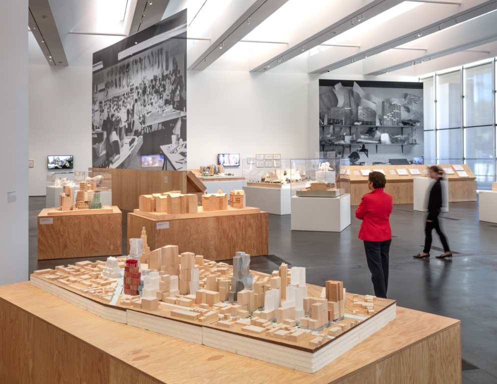
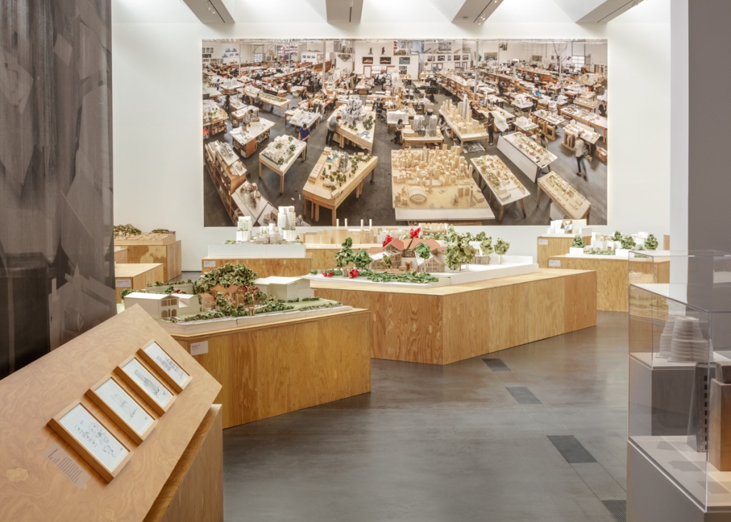
Presenting a comprehensive examination of one of the most important architects in Southern California, Frank Gehry features over two hundred drawings, many of which have never been seen publicly, and more than sixty-five models that illuminate the evolution of the architect’s thinking. The exhibition traces the entire arc of Gehry’s career, from the mid-1960s through the present, and focuses on the themes of Urbanism, De-composition | Segmentation, Composition | Assemblage, Interaction | Fusion, Conflict | Tension, Flux | Continuity, Unity | Singularity, and Technology.
The Canadian-born, Los Angeles–based architect Frank O. Gehry has revolutionized architecture’s aesthetics, social and cultural role, and relationship to the city; his understanding of the city’s heterogeneous nature and its fluidity has distinguished him as a revolutionary urbanist. Gehry’s works—from his residence in Santa Monica (1977–78, 1991–94) to Walt Disney Concert Hall (1989–2003) in downtown Los Angeles and Fondation Louis Vuitton (2005–14) in Paris—have demonstrated the architect’s questioning of a building’s means of expression. This architectural inquiry has resulted in new methods of design and technology as well as an innovative approach to materials in order to free architecture from its conventions.
After moving from Toronto to Los Angeles in 1947, Gehry graduated with a degree in architecture from the University of Southern California in 1954. He then went on to study city planning at the Harvard University Graduate School of Design. After working for a number of property developers and architects, including Victor Gruen, inventor of the shopping mall, Gehry established his own Los Angeles office in 1962. He drew inspiration from Southern Californian architects such as Harwell Hamilton Harris, Raphael Soriano, and Frank Lloyd Wright; additionally, his fascination with alternative materials and his desire to confront Modernist conventions aligned him with a group of Los Angeles artists who shared similar concerns, including Larry Bell, Ron Davis, Robert Irwin, Ed Moses, Ken Price, and Ed Ruscha, as well as East Coast artists Jasper Johns, Claes Oldenburg, and Robert Rauschenberg. As his reputation grew, Gehry received prominent, high-budget commissions that allowed him to realize complicated and ambitious designs, for which he was awarded the prestigious Pritzker Architecture Prize in 1989.
Frustrated that the forms he wanted to build could not be translated properly into two-dimensional plans, Gehry adapted CATIA (Computer Aided Three-Dimensional Interactive Application)—a software tool that allows the digital manipulation of three-dimensional representations—to facilitate the construction and engineering of his radical designs. Unencumbered by technological limitations, Gehry entered one of his most prolific periods, which continues today with projects in Australia, Canada, the Czech Republic, France, Germany, Hong Kong, Japan, Panama, and Spain, among other locations.

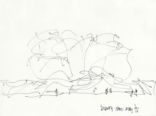
Organized by curators Frédéric Migayrou and Aurélien Lemonier at the Centre Pompidou, Musée National d’Art Moderne, Paris, and adapted for LACMA’s presentation by Stephanie Barron, senior curator and department head of Modern Art, with Lauren Bergman, assistant curator of Modern Art, Frank Gehry traces the arc of the architect’s career through working models and sketches. His design process originates with sketches whose emotive, continuous lines capture the energy of the building and distinguishes its forms. Gehry and the Gehry Partners, LLP team then produce models in a variety of scales that he can manipulate by hand—his immediate, direct relationship with his models and sketches reveals the arduous and contemplative design process of one of today’s most extraordinary architects.
To elucidate the development of Gehry’s architectural style, the exhibition is divided into six conceptual, chronological themes, and urbanism is at its center.
Urbanism
Urbanism is the conceptual thread that has connected Gehry’s oeuvre. He has produced numerous urban projects since his office opened in 1962, including housing developments, studies for urban renewal, shopping centers (including Santa Monica Place), large industrial sites, and plans for the restructuring of city centers. He focuses on mixed-use programs, development of public space, and the building’s materiality in order to construct a dynamic relationship between a building and its surrounding environment, thus creating lively urban landscapes. He explains, “My intention is to be part of each place . . . to work contextually, but not to pander to tradition. . . . I don’t consciously take Los Angeles with me . . . I take me with me, whatever that is. I think Bilbao relates to there, and Prague relates to there. I wouldn’t have done those buildings in Los Angeles.”
De-composition | Segmentation (1965–80)
Gehry designed numerous projects for property developers and urban planning agencies; however, commissions for houses and artist studios allowed him to experiment more liberally. He developed an architectural vernacular rooted in a few key concepts: a building’s relationship with its environment; the use of economical industrial materials (galvanized chain-link fencing, corrugated metal sheeting, cardboard, and asphalt); and a new approach to wood construction. He segmented the individual elements of a building’s geometric structure in order to instill in his works a sense of immediacy and expression that would humanize his constructions. In projects such as the Familian and Gehry Residences (both 1977–78), the architect accomplishes this by exposing and emphasizing the woodstud wall framing and using materials associated with a construction site.

Composition | Assemblage (1980–90)
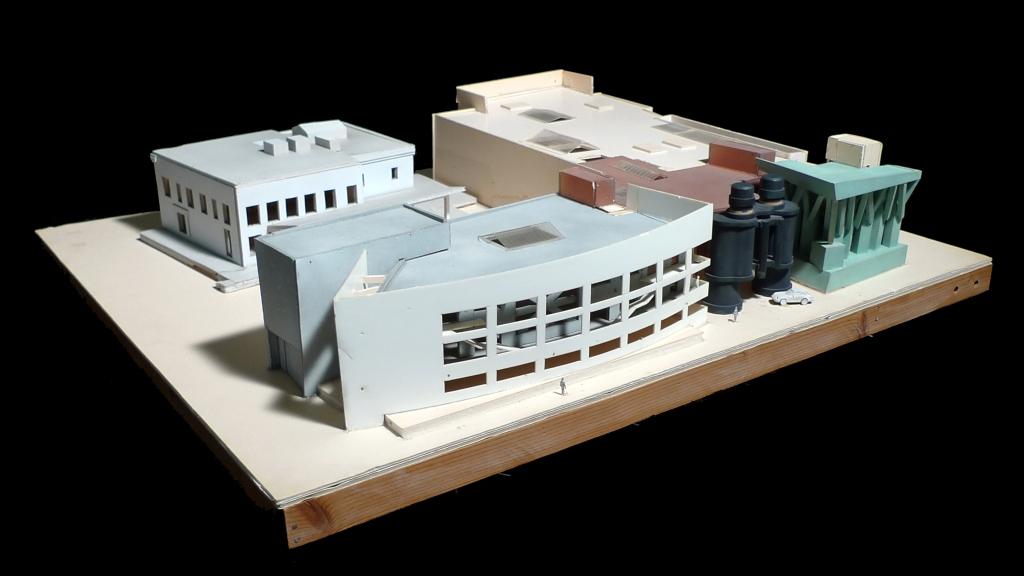
In the early 1980s, Gehry was greatly influenced by architect and theorist Philip Johnson’s concept of a “one-room building,” which called for the separation of functional elements into discrete structures. He arranged these singular buildings based on this urbanist approach, focusing equally on the relationships between these constructions and the interstitial, or in-between, spaces they create. First challenging the architectural form’s identity and then redefining the assembly of the projects’ parts, Gehry invented an architectural style based on interrelation, which can be seen clearly in the collaboration of Gehry and artists Claes Oldenburg and Coosje van Bruggen for the Chiat\Day advertising agency (1985–91).

Interaction | Fusion (1990–2000)
Conscious of the aesthetic limitations of building with segments and assemblage, Gehry sought to revive the principle of continuity in his structures. In the evolving designs for the Lewis Residence (1989–95), Gehry grew enamored by the dynamic movement of drapery, using this concept to create overlays that joined previously discrete elements and married structure, material, envelope, and ornament. During this period, Gehry began exploring the potential of new forms with CATIA, which allowed his contractors and engineers to produce exactly what he envisioned: a genuine architecture of continuity whereby walls and roofs became an envelope wedding the isolated volumes of a formerly fragmented project. The Guggenheim Museum Bilbao (1991–97) is one of the most exemplary demonstrations of this conceptual shift.

Conflict | Tension (1990–2000)
Gehry’s focus in the 1980s on interstitial spaces led to a fascination with tension and attraction. The architect created contradictions, clashes, abrupt changes, and conflict to reference the heterogeneous nature of the urban city. In the Ray and Maria Stata Center at the Massachusetts Institute of Technology (1998–2004), towers of brick, steel, and other materials crash into and envelop one another, reflecting the building’s multidisciplinary program. His pursuit of an architecture in which the negative spaces between the structures intensifies the city’s energy found one of its most powerful expressions in Los Angeles’s Walt Disney Concert Hall (1989–2003).
Flux | Continuity (2000–2010)
In the early 2000s, Gehry began exploring continuous metallic envelopes that dominate, overlay, and redefine the facade and roof. In projects such as the Quanzhou Museum of Contemporary Art (2012, to be determined), the architect surrounded the entire building structure from ground to roof in a singular, red titanium enclosure. Its playful and dramatic nature blurs the definitions of facade, roof, and all other traditional points of reference. Digital simulation provided the flexibility to fuse the building’s constructive structure with its envelope, thus conferring the notion of ornament to the essential structures. Such fluidity produced buildings free of conventions: an organic, living architecture buoyed by the complex rhythms of the city.

Unity | Singularity (2000–2015)
Gehry again questioned the identity of the architectural object. He simplified the more chaotic forms in favor of a return to unified, singular buildings. The Üstra Office Building (1995–2001), a parallelepiped with a slight twist, was the first to reopen this inquiry, which he further explored with New York’s 8 Spruce Street (Beekman Tower) (2003–11). Paris’s Fondation Louis Vuitton (2005–14) comprises billowing glass sails that cover and unify the interior galleries, while instilling the building with a palpable sense of movement, as if it were a sailboat about to embark at any moment. These urban projects not only reimagine traditional structures—the skyscraper and the Beaux-Arts museum, for example—but also reveal the fragile relationships and tensions between a building and its environment.

Technology
In the late 1980s, two-dimensional construction plans were no longer adequate due to the increasing complexity of the geometric forms Gehry envisioned. He worked with Dassault Systèmes to adapt their software CATIA. His unorthodox forms—much like the airplanes and ships for which the design software was initially created—were most effectively articulated through three-dimensional modeling. In 2002, he founded Gehry Technologies, which was dedicated to the research and development of digital technologies. Heralding a new way of approaching construction, Gehry Technologies created an add-on to CATIA called Digital Project, which is now used by architects all over the world as a bridge between the architect and the building contractors. For Gehry, “This technology provides a way for me to get closer to the craft. . . . It feels like I’ve been speaking a foreign language, and now, all of a sudden, the craftsman understands me. . . . [T]he computer is not dehumanizing; it’s an interpreter.”
Gehry Partners: In the Studio Now
LACMA’s presentation of Frank Gehry includes an additional gallery featuring several projects currently being designed or constructed. This body of current work reveals his unique ability to consistently evolve and conceive of new forms and materials deployed in original ways. For example, while known for his striking exteriors, for Facebook’s West Campus Building (2012–15) in Menlo Park, California, Gehry devised a 430,000-square-foot, single-level office space whose rooftop is a sprawling ten-acre garden that camouflages the building from above. For Gehry, it is imperative to keep pushing boundaries: “You can’t redo old ideas . . . you can learn from the past but you can’t continue to be in the past. I cannot face my children if I tell them I have no more ideas and I have to copy something that happened before. It is like giving up and telling them there is no future for them.”


